Rising inequality? A stocktake of the evidence
Commission research paper
This research paper was released on 28 August 2018 and its purpose is to contribute to an informed discussion in Australia by bringing together and taking stock of the latest and most complete evidence measuring the prevalence of, and trends in, inequality, economic mobility and disadvantage across Australian society.
Download the highlights package (executive summary and key visuals)
Download the paper
- Rising inequality? A stocktake of the evidence (PDF - 1.8 MB)
- Rising inequality? A stocktake of the evidence (Word - 1.4 MB)
Download the chart data
Infographic
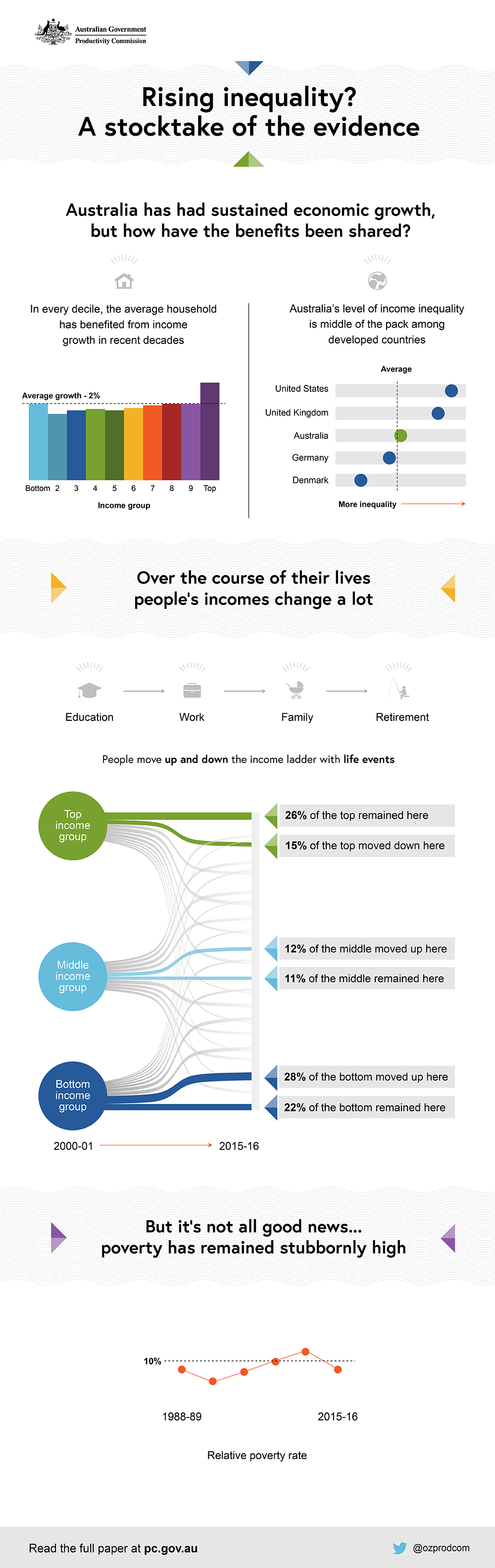
Australia has had sustained economic growth, but how have the benefits been shared?
In every decile, the average household has benefited from income growth in recent decades.
Graph shows growth of all ten decile (10% groupings) income groups. The bottom 10% of income earners were at the average growth of 2 per cent. The top 10% grew higher than the average. The remaining deciles grew at 2 percent or slightly less, reducing slightly for each lower decile with the exception of the bottom group.
Australia's level of income inequality is middle of the pack among developed countries.
Graph shows five countries and their relative inequality. Australia was in the middle slightly above the average. Of the five countries, in order of most inequality to least is the United States, United Kingdom, Australia, Germany and Denmark. Germany and Denmark are below the average.
Over the course of their lives people’s incomes change a lot
Diagram shows transition from Education to Work - to Family - to Retirement.
People move up and down the income ladder with life events.
Diagram shows the change of the top, middle and bottom income groups from 2000-01 to 2015-16.
- Top income group
- 26% of the top remained at the top
- 15% of the top moved slightly down
- Middle income group
- 12% of the middle moved slightly up
- 11% of the middle remained in the middle
- Bottom income group
- 28% of the bottom moved slightly up
- 22% of the bottom remained at the bottom.
But it’s not all good news... poverty has remained stubbornly high
Graph shows that between 1988-89 and 2015-16, the relative poverty rate has hovered around 10%.
Printed copies
Printed copies of this report can be purchased from Canprint Communications.
Publications feedback
We value your comments about this publication and encourage you to provide feedback.
Related publications
Seven stories from 'Rising inequality? A stocktake of the evidence'
Chairman Peter Harris teamed up with Commissioner Jonathan Coppel to deliver a speech to the National Press Club in Canberra on 28 August 2018.
A snapshot of inequality in Australia
This paper provides an update on the state of economic inequality in Australia, reviewing the period of the COVID-19 induced recession and recovery.