Vulnerable private renters: evidence and options
Commission research paper
This research paper was released on 25 September 2019. The paper examines the experiences of vulnerable people in the private rental market. It also discusses policies that affect outcomes for vulnerable renters.
Erratum: Several minor interpretation and calculation errors of historical Census data that were used to create figures 1 and 1.2 have been rectified following this paper. The correct data are contained the chart data (XLSX file) below.
Download the paper
Visual Summary
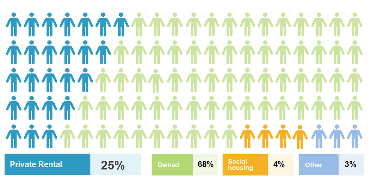
Slide 1: The private rental market houses a quarter of Australian households: private rental 25%, owned 68%, social housing 4%, other 3%.
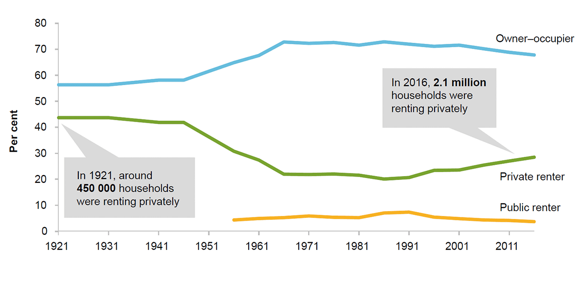
Slide 2: This figure shows the share of households by tenure type from 1921 to 2016, based on Census data. Owner–occupation grew strongly from the mid-1940s to the mid-1960s to make up more than 70 per cent of households, with private renting declining commensurately. After a period of relatively little change, the trend reversed from the mid-1980s onwards. The proportion of households in public housing also fell over the latter period.
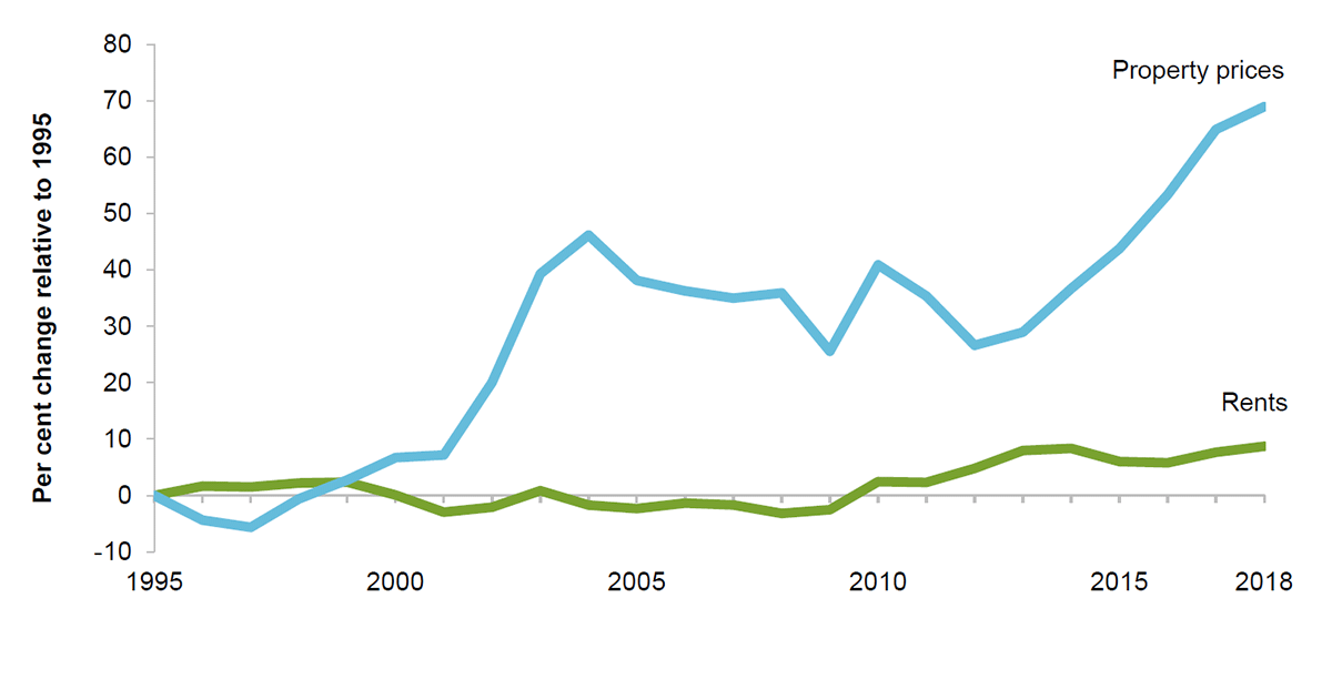
Slide 3: Property prices have soared above incomes and rents in the past two decades. This figure shows the per cent change in the ratios of mean property sales prices and mean rents to mean household disposable income, from 1995 to 2018. The property price ratio increased significantly since 2001, while the rent ratio has only grown slightly.
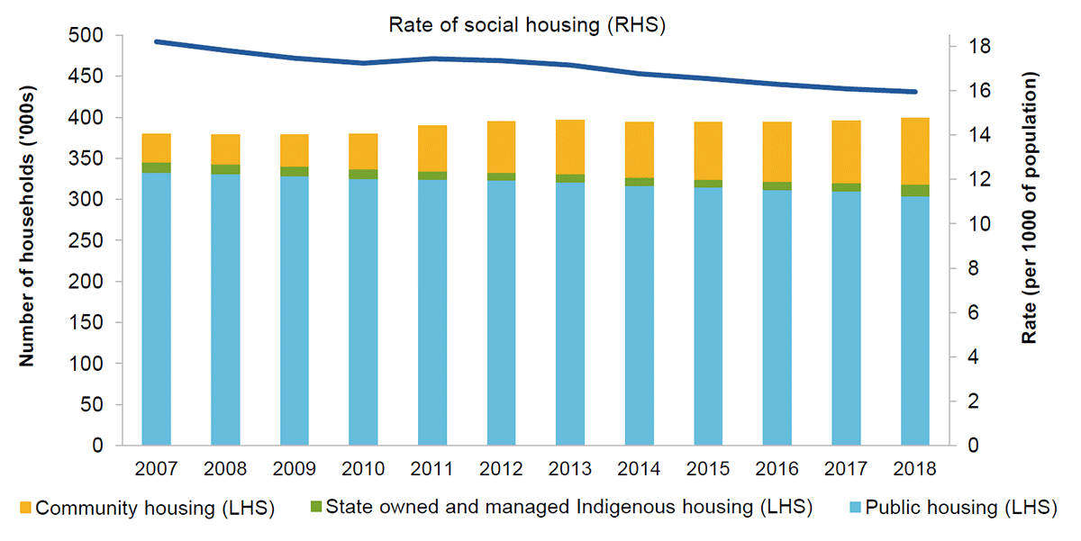
Slide 4: This figure shows the number of households in public housing, community housing and state owned and managed Indigenous housing, and the combined rate of all three forms of social housing per the total population, from 2007 to 2018. Public housing slowly declined since 2007 (while community housing grew) but still accounts for the large majority of all social housing. The total number of households in community housing remained steady at just below 400 000, representing a modest decline in the rate of social housing per 1000 of the population.
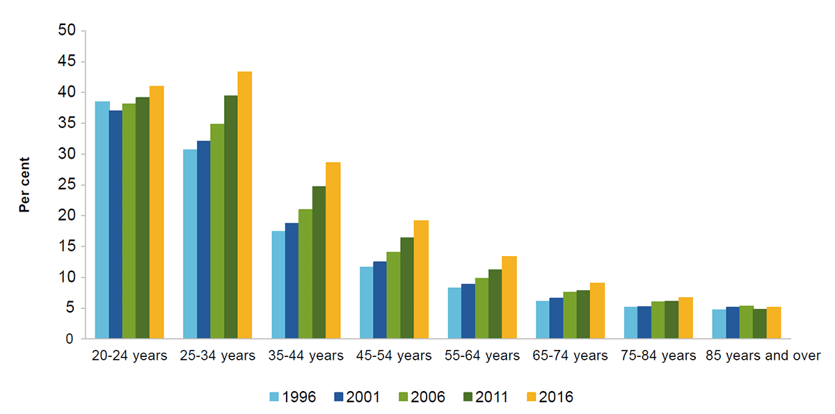
Slide 5: Private renting is on the rise among nearly all age groups. This figure shows the rate of private renting by age group for the five years of the Census from 1996 to 2016. Renting has grown more common among all age groups except for 85 years and over.
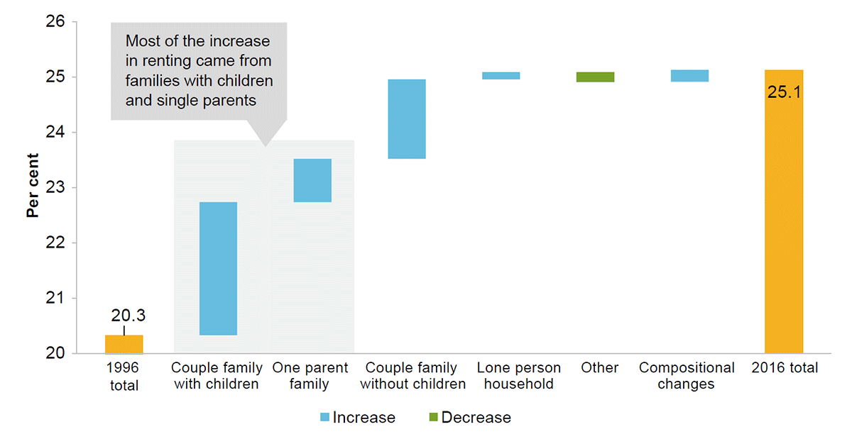
Slide 6: Families with children have led the increase in private renting. Contributions from each household family type to the overall increase in the rate of private renting between 1996 and 2016. Most of the increase in renting came from families with children and single parents.
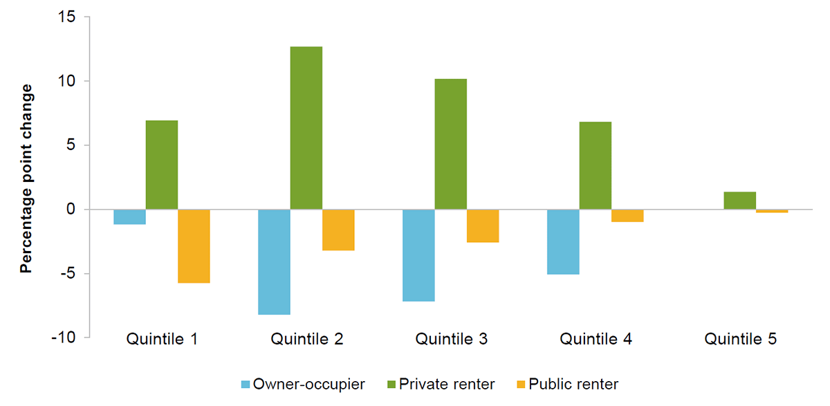
Slide 7: Households in the low and middle income quintiles have moved into the private rental market in greater numbers.This figure shows the percentage point change in the proportion of households in different tenures between 1994–96 and 2015–18, by equivalised household income quintile. In every quintile, private renting has grown more common, and both owner–occupation and public renting have grown less common. Private renting increased the most in quintiles 2 and 3, offset mostly by a decrease in owner–occupation. The decrease in public renting was greatest in quintile 1, for which it was larger than the decrease in owner–occupation.
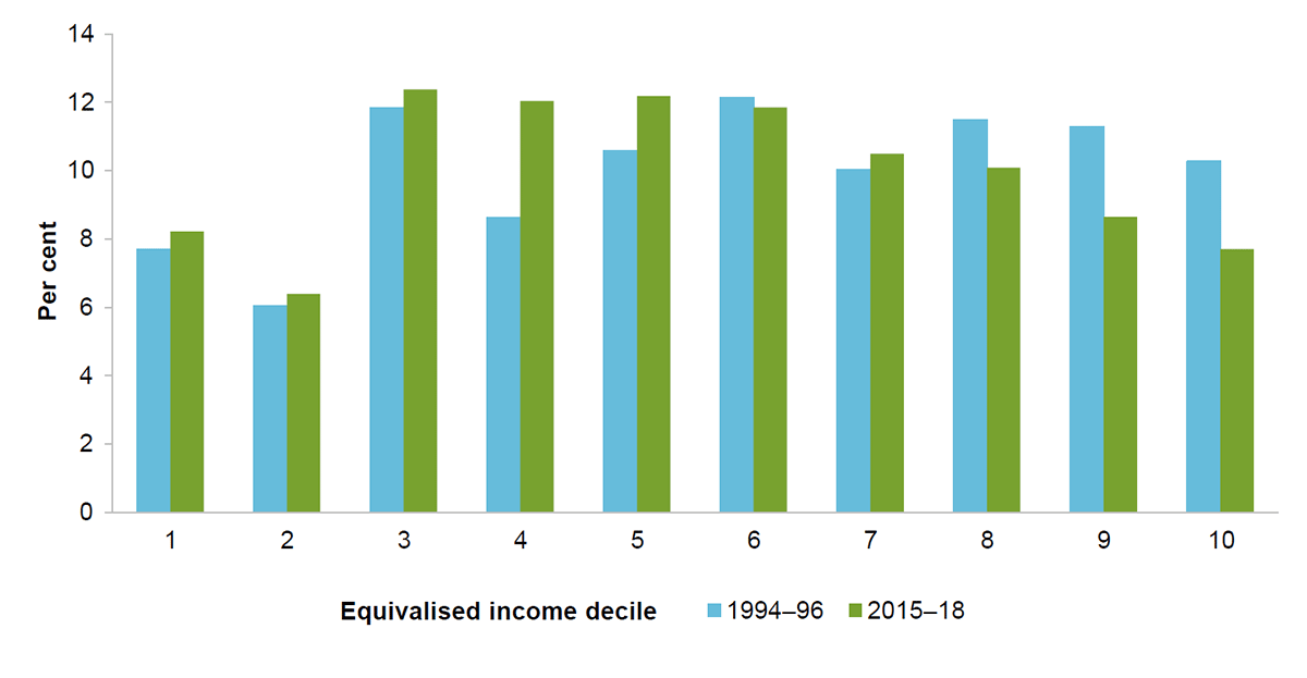
Slide 8: The private rental market is made up of more low to middle income households, and fewer high income ones. This figure shows the equivalised income decile distributions of private renter households in 1994–96 and 2015–18. The 1994–96 distribution is made up of a slightly greater proportion of households in the middle and upper income deciles than those in the lower ones. Contrastingly, the 2015–18 distribution is slightly concentrated around the low-to-middle income deciles.
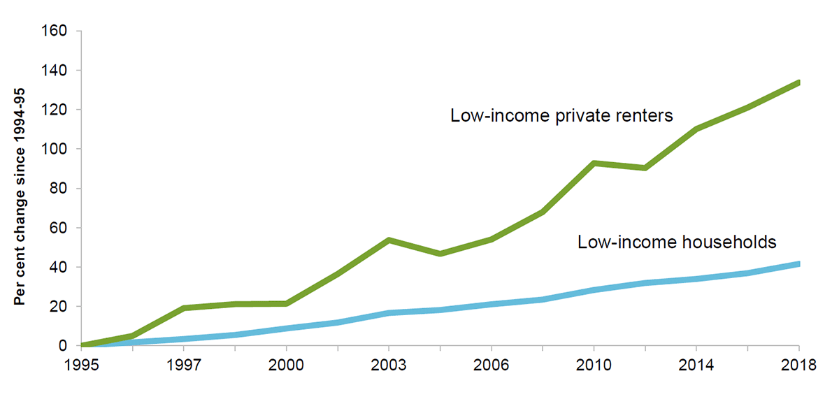
Slide 9: This figure shows the per cent change in the number of low-income private renters, and the number of low-income households generally, between 1994-95 and 2017-18. The number of low-income private renters grew at a faster rate than the number of low-income households over the period.
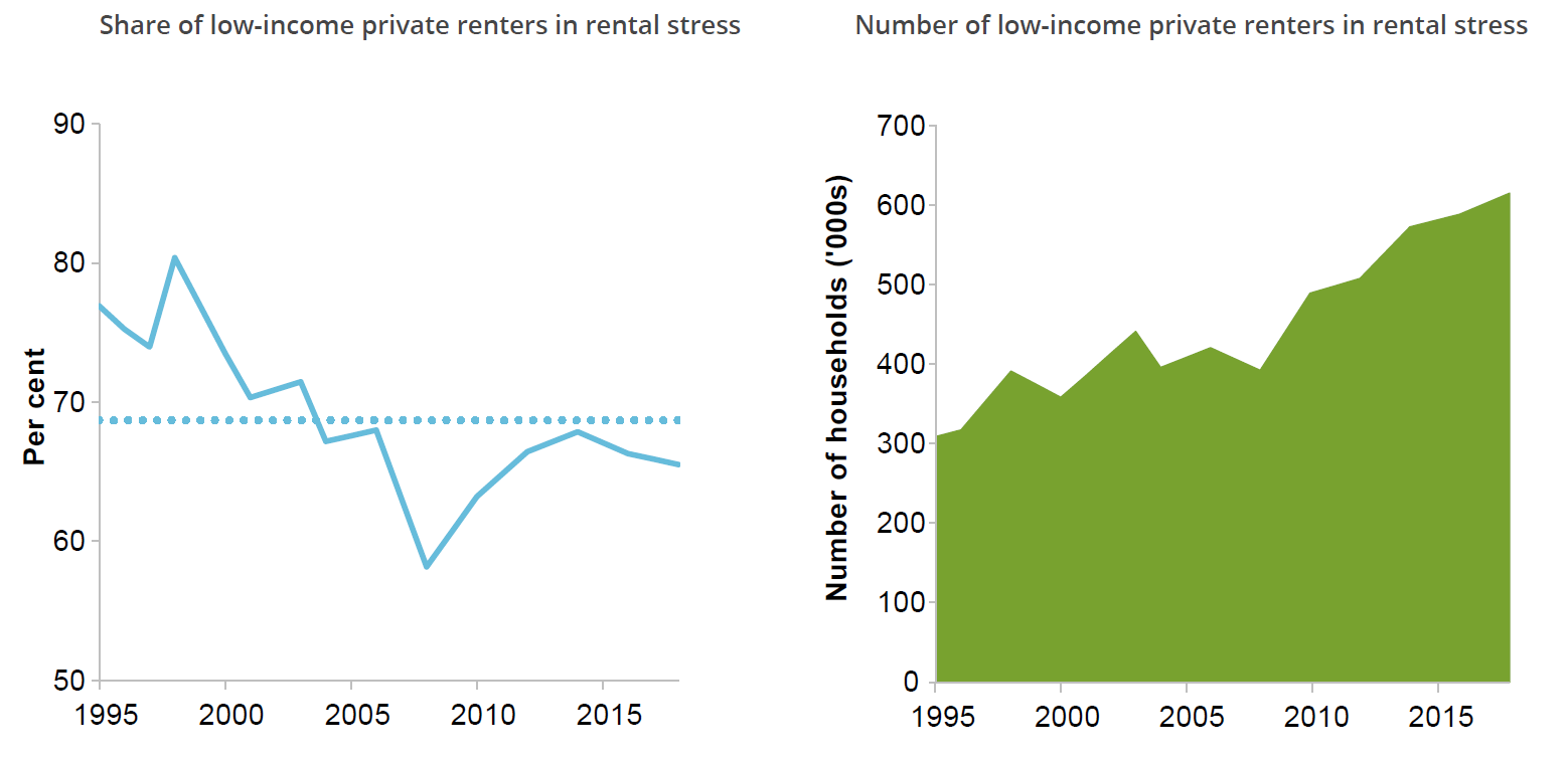
Slide 10: The left panel shows that the share of low-income private renters in rental stress declined between 1994-95 and the mid-2000s, before increasing at a slower rate in the following decade. By 2017-18, the share was slightly lower than in 1994-95. The right panel shows the number of low-income private renters in rental stress between 1994-95 and 2017-18. There were just over 300 000 private renters in rental stress at the beginning of the period, with the number increasing in most years and having doubled by 2017-18.
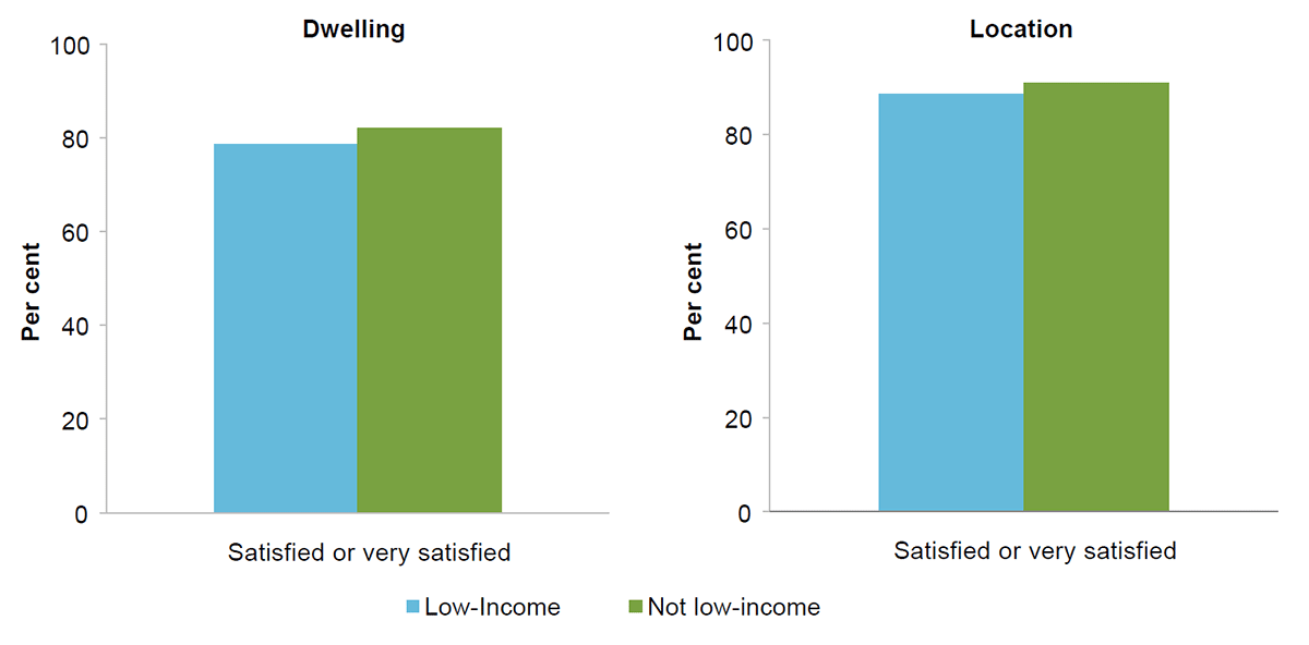
Slide 11: Low-income renters are less satisfied with their housing. This figure shows two charts. The first contrasts the share of low-income and non-low-income renters who are ‘satisfied or very satisfied’ with their dwelling; low-income renters are significantly less satisfied than non-low-income renters. The second contrasts the share of low-income and non-low-income renters who are ‘satisfied or very satisfied’ with their location; low-income renters appear slightly less satisfied than non-low-income renters, however this difference is not statistically significant.
Slide 12: This figure has two panels. The left panel shows that the share of low-income private renters in rental stress declined between 1994-95 and the mid-2000s, before increasing at a slower rate in the following decade. By 2017-18, the share was slightly lower than in 1994-95. The right panel shows the number of low-income private renters in rental stress between 1994-95 and 2017-18. There were just over 300 000 private renters in rental stress at the beginning of the period, with the number increasing in most years and having doubled by 2017-18.
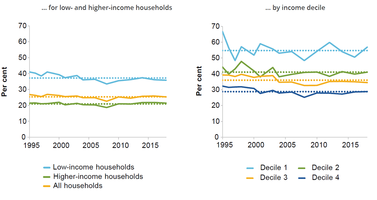
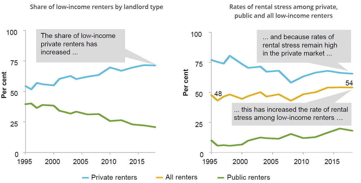
Slide 13: This figure has two panels. The left panel shows that the share of low-income renters who are private renters has increased and the share who are public renters has declined over the period 1995 to 2018. The right panel shows the share of low-income renters in rental stress from 1994-95 to 2017-18, and the share of low-income private and public renters in rental stress from 1994-95 to 2017-18. Rates of rental stress have increased among all low-income renters taken together, but the rate for private renters has generally declined. Because the rates of rental stress remain high in the private market, this has increased the rate of rental stress among all low-income renters.
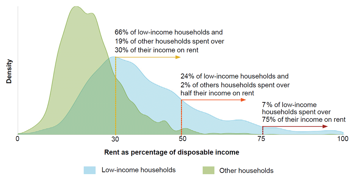
Slide 14: This figure shows the distribution of rent-to-income ratios among low-income and other private renter households in 2018. Low-income households tend to have higher rent-to-income ratios.
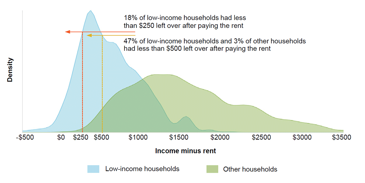
Slide 15: This figure shows the distribution of residual income (household income minus rent) for low-income and other private renter households in 2018. Low-income households tend to have less money left over after paying the rent.
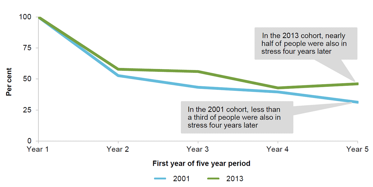
Slide 16: While many people exit rental stress quickly, the proportion in persistent stress has increased. This figure shows the share of people in rental stress in a given year who were in rental stress 1, 2, 3 and 4 years later. This is done for four five-year cohorts: people renting from 2001 to 2005, people renting from 2005 to 2009, people renting from 2009 to 2013 and people renting from 2013 to 2017. Around 40 to 50 per cent of people exit rental stress after the first year in stress across every cohort. In the 2009 to 2013 and 2013 to 2017 cohorts nearly half of the people in rental stress in the first year were also in rental stress four years later. In the 2001 to 2005 and 2005 to 2009 cohorts less than a third of the people in rental stress in the first year were also in rental stress four years later.
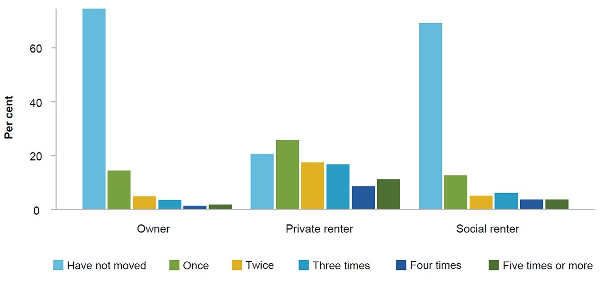
Slide 17: Private renters are more mobile than owner-occupiers or social housing tenants. This figure shows the distribution of times moved in the past five years, by whether an individual is an owner-occupier, private renter or social renter. The majority of owner-occupiers and social renters did not move at all. Private renters were most likely to have moved once.
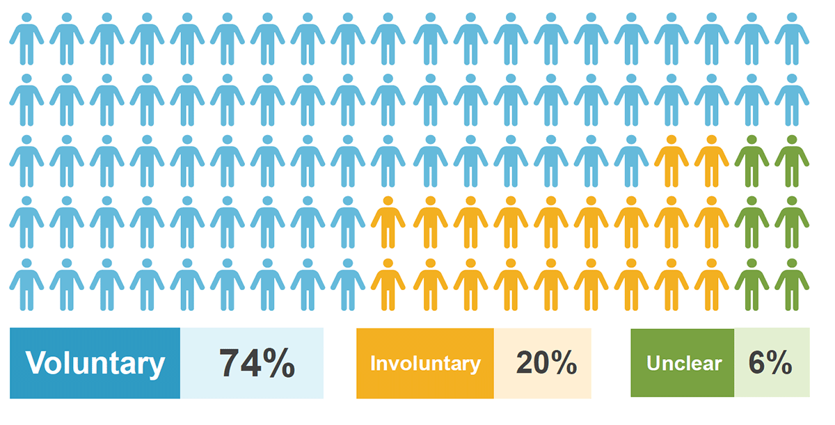
Slide 18: Infographic: 74% of the most recent residential moves were voluntary, 19% were likely to be involuntary and 7% were unclear.
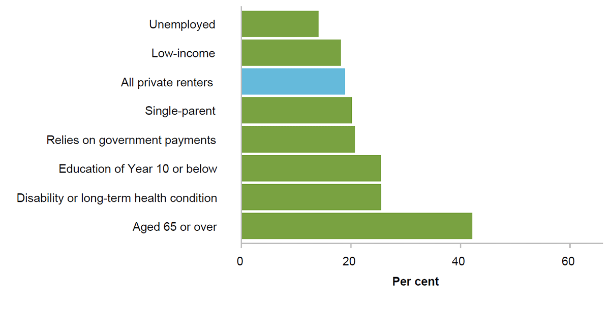
Slide 19: This figure shows the proportion of private renters who most recently moved because of a landlord notice, by various household characteristics. Households where the reference person was unemployed and low-income households were less likely than private renters in general to have moved for this reason. Single-parent households and households where reference persons were reliant on benefits, had low education, had a disability or long-term health condition, or were 65 or over were more likely.
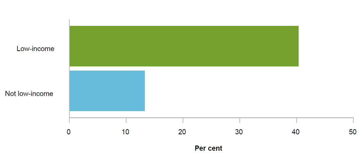
Slide 20: Low-income renters have smaller financial buffers. This figure shows the proportion of private renters who would be unable to raise $2000 within a week for an emergency, by whether the renter lives in a low-income household. 40 per cent of low-income private renters would be unable to raise this money, compared to just 13 per cent of non-low-income private renters.
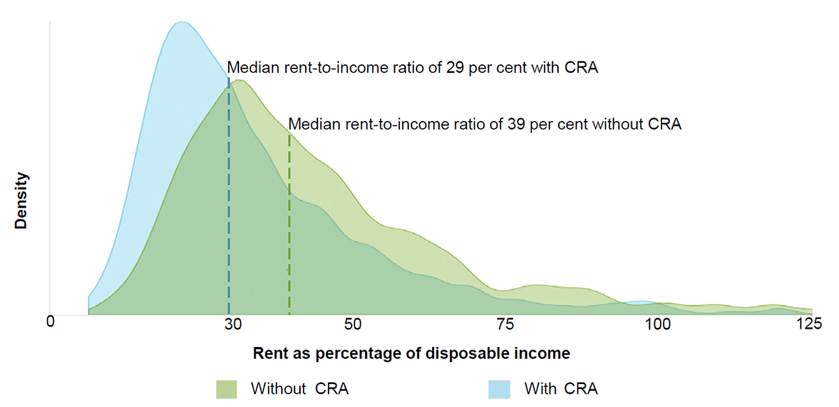
Slide 21: Commonwealth Rent Assistance improves affordability. This figure shows the distribution of rent-to-income ratios among low-income private renter households where CRA is received, and a counterfactual distribution without CRA, in 2018. The figure shows that rent-to-income ratios would be higher for these households without CRA – the median rent-to-income ratio with CRA among this group is 29 per cent, and would be 39 per cent without CRA.
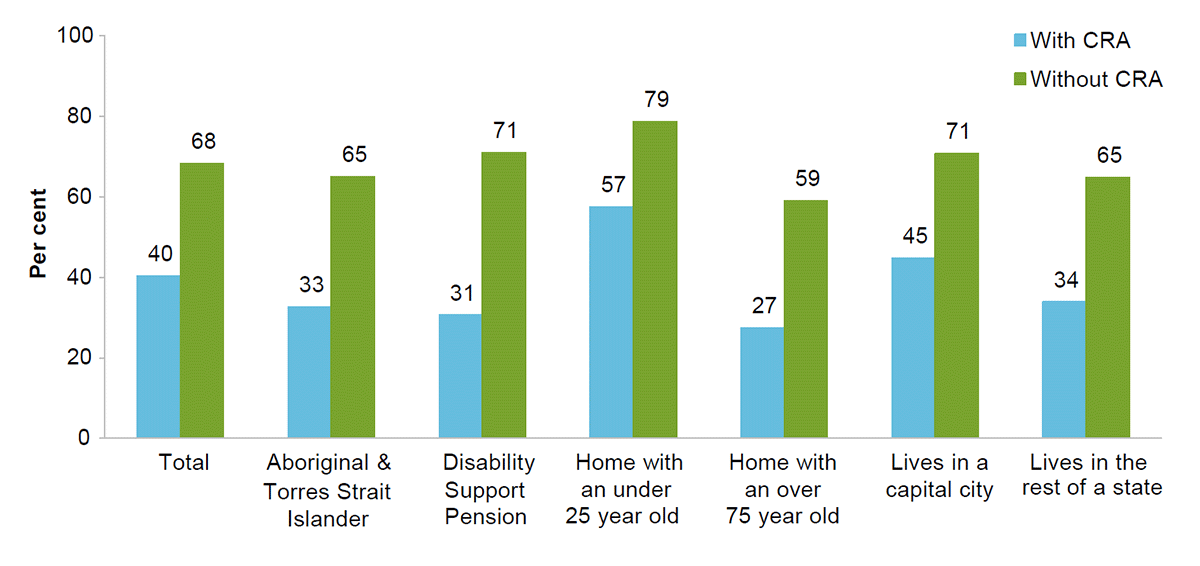
Slide 22: Rental stress with and without Commonwealth Rent Assistance. This figure shows the proportion of households currently receiving CRA which would be in rental stress with and without CRA payments by household vulnerability characteristic. The figure shows a higher proportion of households would be in rental stress without CRA.
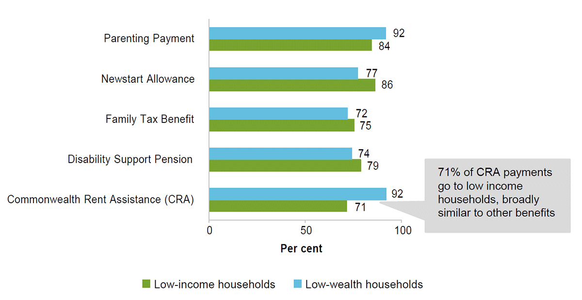
Slide 23: Share of a range of government income support payments (for example the Age Pension) going to low-income or low-wealth working-age households (in the bottom 40 per cent of households when they are ranked by equivalised net wealth) in 2018. Among working-age households, 92 per cent of CRA goes to low-wealth households, and 71 per cent to low-income households.
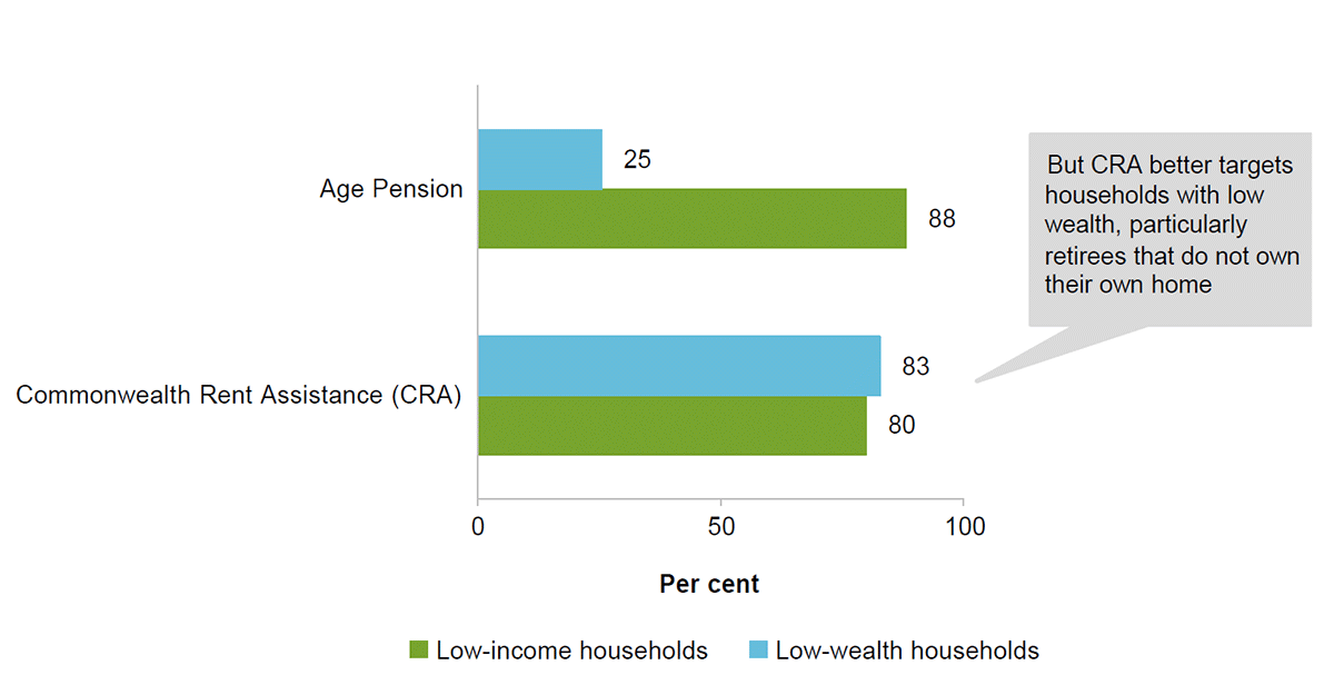
Slide 24: Estimates for non-working age households. Among non-working age households the equivalent figures are 83 and 80 per cent.
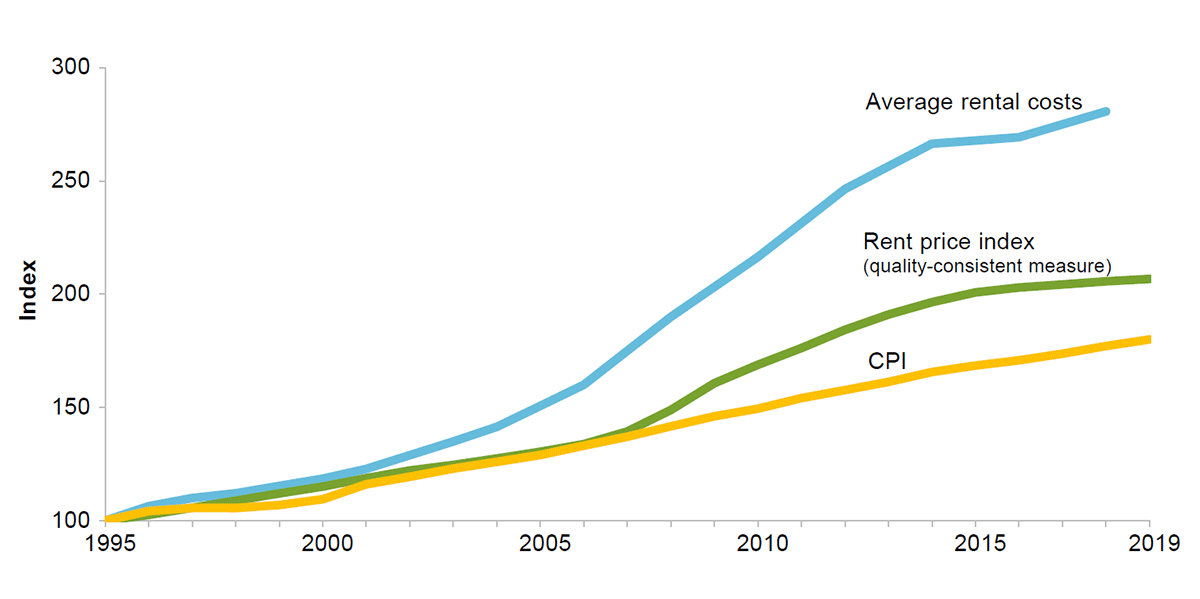
Slide 25: Rents have grown faster than the consumer price index. This figure shows, from 1995 to 2019, the change in average rental costs (as measured using the Survey of Income and Housing), the CPI and the CPI rent price index. The figure shows that the first of these series has grown the most, followed by the CPI rent price index, and then the CPI.
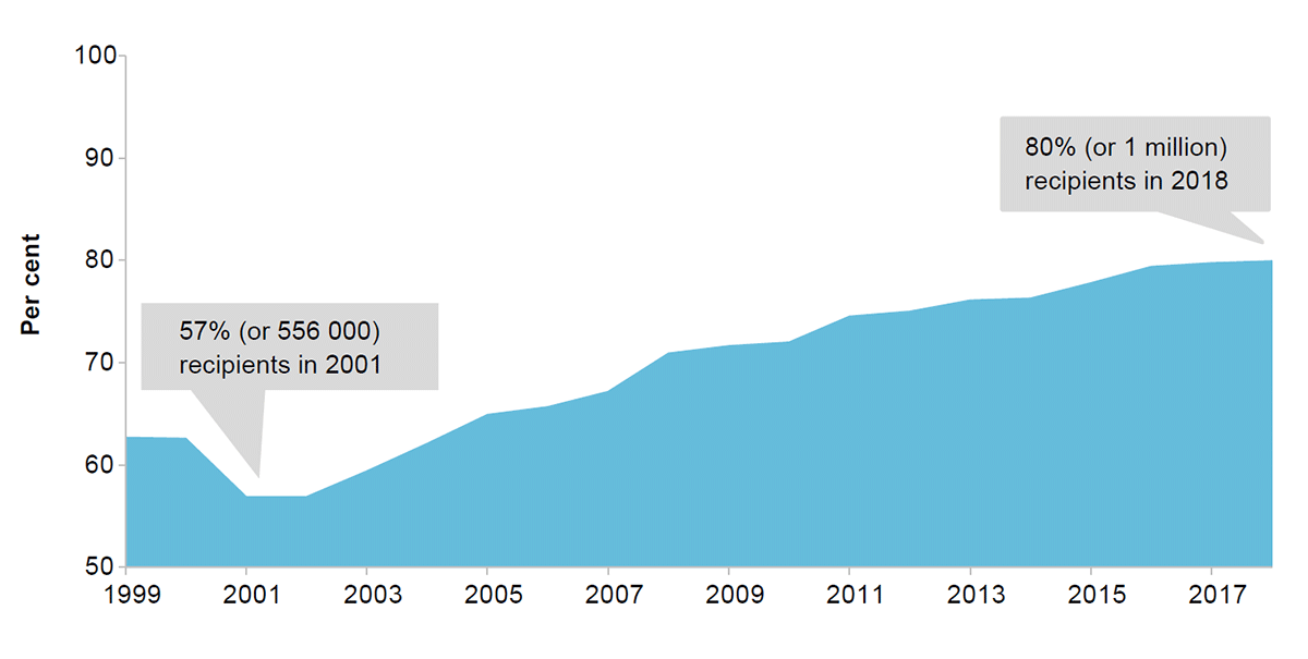
Slide 26: The number of CRA recipients receiving the maximum payment has risen steadily since 2000. This figure shows a rising number and proportion of households are eligible for the maximum payment. In 2001, 57 per cent or 556000 households were eligible whereas 80 per cent or over one million households were eligible in 2018.
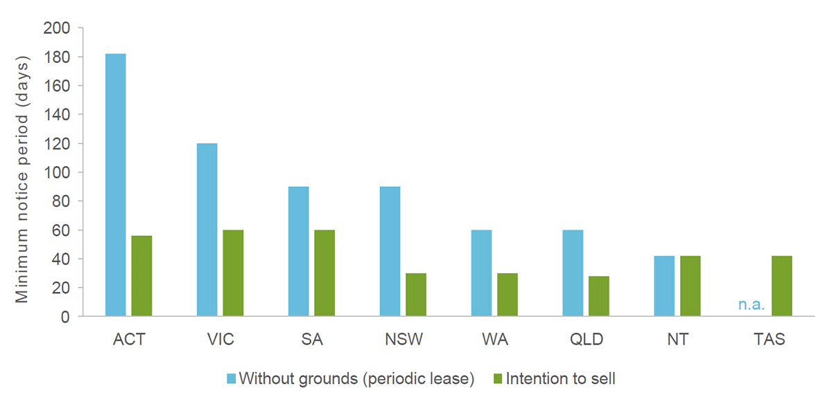
Slide 27: Notice periods for ‘no-fault’ terminations are short in some jurisdictions. This figure is a column chart that shows minimum notice periods for without-grounds evictions and evictions where the owner is intending to sell the property, by state/territory.
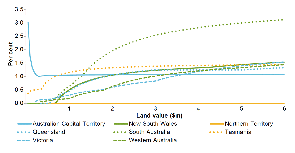
Slide 28: Land taxes are progressive and vary greatly across states and territories. This figure shows the rate of land tax for different land portfolio sizes in each state and territory. Both the rate of taxation and portfolio value threshold for taxation varies substantially by jurisdiction. Effective average tax varies between zero and three per cent.