Superannuation: Performing for all members?
Speech
Our Deputy Chair, Karen Chester, presented a speech to the McKell Institute Executive Policy Forum boardroom luncheon on 6 June 2018 in Melbourne.
Download the speech
Download the presentation slides
- Superannuation: Performing for all members? (PDF - 1500 Kb)
- Superannuation: Performing for all members? (PPTX - 10 959 Kb)
Read the speech
My thanks to the McKell Institute for this opportunity to speak today on our superannuation Inquiry. This is our first (non-media) speaking engagement following the release of our draft report last week. And it is timely as we now enter an important phase of consultation on our draft report – its findings and recommendations.
Whilst the Institute may be relatively young as a think tank – especially here in Victoria – it has already made many thoughtful contributions to public policy thinking in the arenas that matter – health, education, housing, infrastructure and, not least, productivity.
And it’s an honour to follow on from the eminent speakers the Institute has previously hosted at this forum.
Of recent note for the Commission, a speech given by Tim Pallas, the Victorian Treasurer, on federalism. His thoughtful yet frank insights afforded a contemporary perspective on federal state relations whilst completing our recent Inquiry on the GST distribution.
I would like to think the Productivity Commission shares some historical common ground with the Institute’s namesake, Sir William McKell. The historical records plainly reveal that Sir William was driven to provide a better standard of living for ordinary Australians. It is through this lens of the wellbeing of all Australians (not just the vocal few) that we have approached our current inquiry on the super system’s performance – by looking at how the members themselves are faring, and how we can make outcomes better for Australians with super when they retire.
There is perhaps one thing that all participants in our super inquiry can agree upon: there is much content in our draft super report – one commentator suggested more than a Netflix Original. So today, in the time we have, I will focus on its main findings and recommendations. You have probably read and seen much already in the media as the anticipated debate unfolds, much of which has been accurate, but there a few things that haven’t got as much airtime as others and which I’ll draw attention to today.
I’ll briefly canter through:
- our approach to the Inquiry, with some important social context on the system today – it’s a story of an evolving social context;
- the outcomes members are getting – it’s not a world of averages; and
- our proposed package of improvements.
Our draft report is the culmination of much endeavour and consultation by the Commission. It is now more than two years since the Government tasked us to assess the performance of our $2.6 trillion super system. We knew this would be a gargantuan public policy assignment. Its performance matters today for the retirement savings and thus wellbeing of 14.8 million Australians and their families. And those savings represent a fifth of the wealth of all Australian households. Only the family home is of greater wealth value to Australians today.
Some of you may also recall the Commission’s endeavour in retirement incomes commenced even earlier in 2015 with two Commission-initiated reports – Post Retirement Super and Housing Decisions of Older Australians. Indeed these reports had a hand in the Commission being tasked with our current Inquiry.
For our current Inquiry, the Government afforded us the rare opportunity in public policy today to hasten slowly. And for that we are fortunate. It allowed the Commission’s endeavour to span a three stage investigation. In stage 1 we developed criteria for assessing the performance (efficiency and competitiveness) of the super system. Then in stage 2 we developed alternative models for allocating default fund members to products. This was designed to be a ‘top drawer’ report as an input to our current stage 3 inquiry.
We released a draft report for stage 2 last year, and the Government subsequently agreed for us to complete stage 2 alongside the final stage 3 Inquiry.
Since we began the three‑stage process in early 2016, we have received well over 300 submissions, met with over 120 parties in both Australia and overseas, held five technical roundtables and conducted a round of public hearings. And we will continue to consult widely as we finalise our report by the end of this year.
Much of the analysis in our draft report is new and novel. No-one has assessed the performance (through the lens of efficiency and competitiveness) of a superannuation or pension system in its entirety before, so we had to venture into new territory. Now many may emit a yawn in thinking of our stage 1 study – developing an assessment framework. It consisted of 5 system level objectives, 22 assessment criteria, and 79 points of evidence to gather and analyse. But this stage was critical to the draft report we released last week. For it gave us the latitude to undertake in-depth and novel analysis to inform our findings. For good public policy can rarely emerge unless it is coaxed through a comprehensive and robustly harvested evidence base. So we worked out in stage 1 what we had to harvest and how. And we also identified where we had to extract or develop new data to inform that evidence base and analysis. And in a calmer environ than we find ourselves in today.
One of the key innovations was to construct investment benchmark portfolios. To allow us to compare performance, agnostic of asset allocation. The benchmark portfolios are weighted averages of financial market index returns, with the weights determined by the asset allocation of the fund, segment or product we are benchmarking. We then made adjustments for investment fees, admin fees and taxes that reflect the experience of super funds.
So our benchmarks are a measure of whether funds are adding value against the market’s performance. And by adjusting for differences in asset allocation, we are able to do what no-one has managed to do before – compare apples and zebras. Now, such benchmark analysis is not new and novel for the super funds. Indeed to undertake basic performance attribution should be bread and butter. But what is new and novel is to do it across an entire super system (by segment, fund and product). And the sweat that accompanied our endeavour was a function of the very poor data we had to work with.
Importantly, we are using our benchmark to identify where there is long-term underperformance in the system. We define underperformance as being 25 basis points or more below the benchmark – a margin allowing us to err on the side of affording funds the ‘benefit of the doubt’ and to reflect the modicum of uncertainty in the benchmarks arising from data issues, all of which we document in our draft report.
Another novel feature of our report is its cameo analysis – we used these to show how the performance and problems of the super system can compound over time to add to or erode members’ retirement balances. Most of the cameos assume a full-time worker starting their first job today at age 21 and retiring at 67, in the year 2064. But we also undertook a cameo for a 55 year old today, also retiring at age 67. The cameos reveal both the downside of today’s problems and, of equal import, the upside to the problems being removed. And some of the cameos show how regressive some of the system’s failings are for particular cohorts of disadvantaged workers – those with disrupted participation in the workforce.
We conducted econometric analysis to measure the impacts of product proliferation on costs and fees, and used stochastic analysis to look at how these fees affect members’ retirement balances. We also used stochastic analysis to assess the value of life cycle products to members. Today these products represent 30 per cent of MySuper products.
And we have advanced our econometric work on economies of scale, to be released as a post-draft report supplementary paper in August.
So before being able to assess the system’s performance we needed to harvest data. To fill the many data gaps we identified in Stage 1, the Commission undertook 4 surveys. Two member surveys and two fund surveys.
The first member survey was an experimental choice survey of members on how members might behave in choosing a super fund when assisted by a shortlist of good products. This was a key input to our assessment of alternative default models.
The second member survey was broader – to gather evidence about members’ understanding of super and their experiences with the system. This provided insights for example on what members value and the incidence of unintended multiple accounts.
On the fund surveys, the first was to gather data on fund activities and outputs – largely filling gaps in what the regulators collect or where the reporting to the regulators is of poor quality. Alas the overall quality of responses to the survey was disappointing. Many participants skipped questions or provided incomplete data. And responses were particularly poor for questions relating to net returns and fees. This has prevented us from doing some important analysis – international performance comparison and better understanding the systemic difference between the performance of industry and retail segments.
The content of the responses (and the gaps) when viewed across all funds proved evidence in and of itself.
We wrote to all fund CEOs on the day of release of our draft report providing a further opportunity to provide the Commission with the key data needed to complete its analysis.
So what outcomes are the 14.8 million Australians with super (along with their families) getting?
Our draft report presents a pretty mixed report card. The good news is that most members are doing reasonably well. The not so good news is that our $2.6 trillion super system has become an unlucky lottery for many members.
And why an unlucky lottery? The system suffers two fundamental flaws that set the odds against many members:
- Members accumulating unintended multiple accounts, and paying billions of dollars each year in unnecessary fees and insurance premiums.
- Entrenched underperformance, not just in the choice segment but also the default (today’s MySuper) segment.
We found that the odds of being a fund member with these two problems is both too high and highly regressive in its impact – causing greater harm to young people, workers on low incomes and workers in an out of the workforce. These are two awkward truths that need to be addressed. And perhaps it seems well known in the industry. As ex RBA (Reserve Bank of Australia) Governor Bernie Fraser observed last week, ‘The problems have been there for yonks but there has been a hell of a lot of inertia’.
Turning first to unintended multiple accounts: We found that one in three member accounts in the system are unintended multiples – that’s about 10 million accounts. That’s because the super system continues to staple the member’s account to the employer and not the worker. So every time a worker changes job, especially for the two-thirds of members who default when they change job, they typically end up with another super account.
To date, the onus has been on members to proactively consolidate their existing accounts, and we know that many members have failed to do this or left it so late that their balances have been seriously depleted. As we can see from this chart, it’s not just young people either – people in their 40s are most affected. But it would appear that most of these unintended accounts are first opened when people are younger or in the formative stages of their careers.
Our estimates suggest these unintended multiples collectively cost the members who hold them $1.9 billion a year in excess insurance premiums and $690 million in excess administration fees — or $2.6 billion in aggregate each year.
And over a working life, an unintended multiple account can leave a typical member with $51,000 or 6 per cent less to retire with. So a case of less member accounts can mean much more in retirement.
The second big flaw is entrenched underperformance. Our analysis reveals that many members are ending up in underperforming funds. For funds as a whole – so taking account of both default and choice members – we found that over 1 in 4 funds underperformed over the 12 years to 2016. We were constrained by data here, and hence only able to look at those funds that have MySuper products (for technical reasons that are documented in the draft report).
What’s important about this chart is it’s a tailored benchmark – tailored to the asset allocation of each individual fund. Poor performers cannot hide behind differences in their asset allocation from that of other funds in the market.
The 20 underperforming funds represent about one-third of the nearly 15 million member accounts in our dataset. About half of the underperformers are retail funds, and a third industry funds.
But again, it’s not all bad news. About 10 million member accounts (67 per cent of our sample) are in funds that beat their benchmark over the 12-year period. As you would have seen from the media coverage, we also found that not-for-profit funds outperform retail funds on average.
But, it’s the distribution that really matters when it comes to the outcomes for an individual member. Or in simple terms – not all members experience the average. Indeed millions do not given the size of our super system.
This cameo shows just how much the dispersion in member outcomes really matters. Being in a bottom-quartile fund can leave a typical member with $635,000 less (or 53 per cent) when they retire, compared to being in a top-quartile fund.
Looking specifically at the default segment, we took the current set of MySuper products (and their predecessors) and tracked as many as we could back over the past 10 years to see how they have performed over this time.
The top 10 did well – a median return of 5.7 per cent a year for their members. And importantly they hold just over half of default member accounts (some 6.1 million or 55 per cent) and just under half of default assets ($225 billion).
But 26 – or about 1 in 3 – underperformed a benchmark reflecting the average asset allocation of MySuper products. They generated a median return of just 3.9 per cent a year for their members. They account for 1.7 million member accounts.
Of these underperforming MySuper products:
- 12 are in retail funds, 10 industry, 3 corporate and 1 public sector
- 8 are life‑cycle products (which make up nearly a third of all MySuper accounts).
Averages and medians conceal a lot of variation – what matters is where the individual members are. The take-out message from this chart is that there is too much variation in the long-term outcomes that default members are getting.
The large differences in investment performance for MySuper products have significant implications for members. We estimated that being in an underperforming MySuper product can leave a typical new workforce entrant $375,000 or 36 per cent worse off by retirement.
And if all members in the underperforming MySuper products had been in the median top 10 MySuper product, they would have collectively been better off by over $1.3 billion annually (or about $770 each annually, on average).
Turning to the choice segment. Looking at the choice segment was challenging – there are over 40 000 products with much variation between them, and data on many of these products are hard to come by, especially over a 12-year time period.
But we managed to capture 362 of the larger investment options in the system, covering about 13 per cent of assets in the choice segment.
And we found that 1 in 2 underperformed a benchmark tailored to their own asset allocation. About three-quarters of these are offered by retail funds, and a fifth are offered by industry funds. And given the self-reporting (positive) bias here – one could argue this is about as good as it gets for the choice segment even if we were to capture more of this segment through an expanded sample.
While we don’t know how many member accounts this represents, there are 11 million members in the choice segment of the system. So, clearly, many members in choice – as well as default – could be doing a lot better.
We also found problems elsewhere in the super system. And given time today I’ll focus less on the detail and more on the common theme. And that is all these problems have regressive impacts – hurting most those members with lower balances, many of whom happen to be younger members, those on lower incomes through their working lives and those who move in and out of the workforce.
Three of the major ones are:
- Fees erode balances. Australians pay around $30 billion each year in super fees (and that doesn’t include insurance premiums). We found that products with higher fees tend to deliver lower net returns over time, even after we have netted off the fees. And just 0.5 per cent in higher fees can leave a member $100,000 worse off by retirement.
- There are over 40 000 products in accumulation, and comparing them is diabolically hard, even for experts. Members are lost in the weeds of the unhealthy troika of product proliferation, poor disclosure and questionable advice. And the irony of the system is that, if anything, products are most complex during accumulation and most simple in retirement – when the reverse constellation is needed for most members. Moreover, there is a positive relationship between the number of options offered by a fund and the average ratio of their fees to net assets. That delta can result in super balances at retirement being between $140,000 and $230,000 lower.
- Insurance. Many members are being defaulted into insurance products they don’t know about (1 in 4 from our member survey) or that materially erode their retirement balances (by up to $50,000). Many young people (especially under 25s) are paying for insurance they simply don’t need. And many end up with ‘zombie’ policies they can’t even claim on. Income protection is the chief culprit here.
And so the super system needs to change and this imperative will only grow in terms of member harm in our ever evolving workforce.
Compared to the environment that gave rise to Australia’s super system back in the late 1980s, contribution levels are much higher, women are more likely to work and life expectancies are higher – put bluntly, much more is at stake today in financial terms.
And things will only get worse unless we change the system. The labour market itself is changing, with multiple job holding becoming more common, and people changing industry and occupation more than in the past. We are already starting to see the gig economy and technologies such as automation breaking down some of the industry and occupational boundaries we once had.
Retirement itself is also evolving. People are working for longer and are retiring with bigger super balances. Retirement is getting more complex too, with rising longevity, wealth tied up in housing and different kinds of risks that need to be guarded against. Retirement will not get any easier for Australians to navigate.
We’ve some ideas on modernising the super system so super is no longer the unlucky lottery it has become for many.
To recap, the odds are not great for members today. 1 in 3 accounts is an unintended multiple. 1 in 4 funds persistently underperform, and even in the better‑performing default segment, 1 in 3 MySuper products underperforms. In choice the odds worsen, with 1 in 2 products underperforming, notwithstanding our small sample size.
Policy initiatives to date have chipped away at some of the problems, but have clearly not gone far enough. Our draft report calls for some fundamental changes to the super system. We want to head-high tackle the twin problems of a member being defaulted into an underperforming fund and accumulating unintended multiple accounts. Fixing these problems would benefit members to the tune of $3.9 billion each year.
To do this, we want to make default the exemplar, and all about the member. So behavioural economics has inspired and informed our thinking. As noted by Professors Nicholas Barr and Peter Diamond in a submission to our inquiry, some people will have bad outcomes if forced to make choices from a large number of funds, meaning the normal forces of supply and demand cannot be relied on. But the use of a competitive process to afford funds access to default members (competition for the market) can harness the benefits of a robust competitive process for members — and based on criteria that matter most to them — in driving better performance and better member outcomes (while also weeding out underperformance).
We have a package of improvements – including 22 draft recommendations – with three elements at its core.
First and foremost, members only default once. And their account is attached to them and moves with them when they change jobs – their super follows them. They will only have a different product if they choose to switch. We are recommending the ATO (Australian Tax Office) put in place new processes to facilitate this, as well as taking stronger action to mop up the existing stock of unintended multiple accounts.
Second, we make funds compete for the new job entrant component of the default market every four years to appear on a ‘best in show’ list of the top performing funds. This list would include up to 10 top performers, with simple and comparable metrics to help members choose. This will make member engagement easier, especially for new workforce entrants. And comparing fund performance at last becomes a possibility.
The ‘best in show’ shortlist will support member engagement, but it does not solely rely on member engagement to work. Those new workforce entrants who fail to make a choice will simply be defaulted into one of the ‘best in show’ funds, determined by sequential allocation. And we learned from our member choice survey that number is likely to be low – some 5 per cent of members.
Funds will need to compete to be on this ‘best in show’ shortlist, and in doing so extend their best in show offer for new workforce entrants to their existing default members. This would see the benefits immediately spilling over to many existing default members. Funds will be selected every 4 years by an independent expert panel set up for the task. And this independent panel should be comprised of experts who can make decisions about what benefits the members.
To guard against poor decisions, the panel’s processes should be transparent, by publishing selection criteria and weights, as well as the reasons for decisions.
The third core element of our package – one that has got much less attention than the other two – is an elevated threshold for MySuper. This is essential to make MySuper a safe list of good funds for members – which it is not today. Raising the bar will mean that underperforming funds must either lift their game, exit with APRA (Australian Prudential Regulation Authority) shepherding their members to another fund or merge. And existing members will be the largest beneficiaries of this.
We are aware that there is already a scale test in MySuper, but it clearly hasn’t worked, with 112 funds in the super system still having less than $1 billion in assets. And these funds have 2 million member accounts. The Government is trying to legislate an outcomes test — a step in the right direction, but we think the outcomes test needs to be bolstered too.
So what will this all look like for members? We are also recommending that the ATO set up a ‘centralised online service’ – a one-stop-shop for members to choose where their super goes when they start a new job, to move to a new fund or consolidate accounts. And to review their current super product against the ‘best in show’ shortlist each time they log on.
We recommend this electronic system be compulsory for all employers and employees. And its design should be based on thorough consumer testing, so we are not being too prescriptive about what it should look like.
Essentially, new workforce entrants are nudged to select a product from the ‘best in show’ shortlist. But they can also see the list of all MySuper products and choose from them, or nominate any other product if they want something else. All MySuper products, whether on the best in show list or not, will have a simple and comparable one page dashboard that will be easily accessible through the online service. Nobody will be forced to choose or switch products at any time.
Existing members can log on at any time, to compare their current product with the best in show list, and to switch if they want. If they have just started another job or re-entered the workforce, their last active super product will become their default product – a very different situation to what happens today.
We see all members benefiting from our proposed changes to default allocation, not just new workforce entrants – though it is new entrants that will immediately no longer be facing the twin risks of being defaulted into multiple accounts and underperforming products.
Under our proposed system, member engagement will be greater, and fewer members would default each year.
Competition would be harnessed and its benefits unlocked – not the unhealthy competition we see today (especially in the choice segment) that favours the funds, but competition that delivers for members. These benefits would include stronger performance, lower fees, and greater innovation.
Now, this is not all about new workforce entrants, and nor is it about shortlisted funds gaining control of all the default contributions in the super system. On the contrary, existing members will remain in their current fund unless they choose to switch. Those that do nothing will benefit from greater and healthy competition in the system, and the requirement that shortlisted funds extend the benefits to their existing members. As a result, most existing default flows will remain where they are unless a fund loses MySuper authorisation under the much needed higher threshold.
But we do expect to see much more voluntary switching than in the past, as we are making engagement a lot safer and simpler. We have undertaken transition modelling. And modelling that APRA has found to be sound and consistent with their role as shepherd being manageable.
A key outcome we envisage from our policy changes is the exit of persistent underperformers, with the tail of persistently underperforming funds departing in an orderly manner and their members shepherded into better performing funds. Ideally the shepherding would be by the existing Trustee board, through a merger they see as in the best interests of their members. But ultimately the regulator stands ready to shepherd when needed.
This won’t lead to a ‘super’ oligopoly as some have suggested. The ‘best in show’ only applies initially to new job entrants — some half a million new members each year with about $1 billion in assets (albeit growing quickly from that starting base). The sheer size of the system — $2.6 trillion today and projected by others to grow to $4.3 trillion by 2032 — clearly has the capacity to support many, many more than just our 10 best in show funds. And the distribution of fund performance over the past 10 years suggests that many good funds will be nipping at the heels of the shortlisted funds every 4 years when the list is revisited.
Importantly, the benefits are not just about default – choice members would see benefits too, and not just from funds lifting their game generally. The ‘best in show’ shortlist would serve to improve financial advice – by becoming a benchmark for advisers to use in recommending products, and for their customers to put pressure on advisers to explain why any product advice diverges from the list. It will also help regulators to enforce the Future of Financial Advice laws. And ASIC (Australian Securities and Investments Commission) has provided us with advice to that effect.
And just how big are the benefits of change? We ran some cameos to look at how much members would be better off if the super system was no longer an unlucky lottery.
By fixing the twin problems of unintended multiple accounts and entrenched underperformance there are huge benefits for many members.
- Even a typical 55 year old worker today would be over $60,000 better off in retirement.
- And for today’s new job entrant, being defaulted once into a top performing fund would see them over $400,000 better off when they retire in 2064.
Specifically, these numbers are for someone being defaulted into a single top performing MySuper product rather than two underperforming products.
Our package of improvements has many other elements too. We are recommending:
- Clearer, simpler and more widely applied product dashboards to help members shop around. ASIC should play a ‘make it happen’ role here.
- Making insurance opt-in for members aged under 25 and with inactive accounts, as well as a process to strengthen the industry’s insurance code and make it binding and enforceable.
- Bringing governance up to best practice, by requiring all boards to maintain and use skills matrixes, setting stronger disclosure requirements around outsourcing, and greater regulator scrutiny of mergers. Mergers are not occurring as often as they should. In the report we highlight as best practice the example of Westscheme’s merger with AustralianSuper. This was a great example of trustees taking the initiative of ensuring members were transferred to a larger fund when alternatively faced with the prospect of growing net cash outflows.
- And we think that regulators need to be member champions, by confidently and effectively policing trustee conduct, enforcing MySuper authorisation and collecting and using more comprehensive and member-relevant data.
- We have not (as some have suggested) made any recommendations relating to funds having compulsory independent directors. We have recommended (draft recommendation 5) what we think should be the de minimus in fund governance to be ‘in show’ at all. Its focus is on the calibre and skills of the trustee board – which we view as mattering most. We have not made any recommendations relating to funds having compulsory independent directors, though we do view a ‘critical mass’ (at least one third) of independent directors as best practice – especially in a world of related party conflicts. And those conflicts exist across the system.
You can read more about these in the draft report.
So what’s next? Public hearings are scheduled for 20 to 22 June, to be held in Sydney, Melbourne and any other capital city where we get sufficient interest. You can register on our website but do it soon, as registrations close 5 business days prior to each hearing. So that means you have until next Wednesday if you want to appear in Sydney.
Responses to our ‘top up’ (or second-chance) funds survey are due by 27 June.
Submissions on our draft report are due on 13 July. And we have opened up a channel for brief comments – a way of making it simpler and easier for members to give us feedback on their experience, their needs and their thoughts on our ideas.
We’ll be putting out three further supplementary papers, on economies of scale (are they being realised and passed through), the fiscal impacts of insurance, and the results of our ‘top up’ funds survey.
And we might also hold two technical roundtables — one on economies of scale, and one on our benchmarking analysis.
We don’t have a specific date for sending our final inquiry report to Government just yet. But it will be before the end of the year.
On a final note, this is a draft report, with draft findings and draft recommendations. And we are open to feedback on their merit. But for feedback to help shape our final report it needs to be accompanied with evidence. And especially evidence on what it means for members.
Hugh Stretton Oration
Chair Danielle Wood delivered the 2024 Hugh Stretton Oration at the University of Adelaide.
Download the oration
Read the oration
I would also like to begin by recognising the Kaurna people as the traditional owners of the land on which we meet today. I acknowledge their deep connection to this place and pay my respects to their elders, past and present and to any Aboriginal or Torres Strait Islander people with us this evening.
Thank you everyone for being here. It is very special for me to be back at the University of Adelaide, the place where I experienced the heady years of my undergraduate Economics degree. Lots of long afternoons in the Reading Room of the Barr Smith library, the occasional equally long one at the Uni Bar (RIP), but an incredible spirit of learning, thinking and debate that was so foundational for me.
A huge thank you to the Provost, Professor John Williams AM, Deputy Vice-Chancellor and Vice-President (Academic) Professor Jennie Shaw and Professor Adam Graycar for having me back. I am honoured to have the Governor Her Excellency the Honourable Frances Adamson in attendance, as well as the University Chancellor, the Honourable Catherine Branson AC KC.
There are also a couple of other very special guests in the audience, my parents Rae and Simon Wood, who are hearing me speak for the first time in a professional setting this evening. And I am grateful that after listening to my almost constant talking from the age of two, they are still willing to come back for more.
Hugh Stretton’s legacy
It is also a huge privilege to have the opportunity to honour the professional contribution of Professor Hugh Stretton AC. Professor Stretton’s incredible intellect and impressive CV has been well detailed by the Vice Chancellor.
Three things stood out to me in reading about his professional life.
The first was his intellectual energy and imagination. I particularly enjoyed the reference provided by one of his former supervisors on his application to lead the School of History:
The first impression is of extremely high intelligence. He uses his gifts quietly, however, and is given as much to listening as to talking... He is quite clearly an exact and energetic scholar, though … I am not at all confident that he will publish either quickly or much. I have no doubt that he would build a School of History soundly and with imagination. 1
Now today, any mention of a relaxed approach to publication might be an automatic disqualifier, but the referee was right about Stretton’s suitability to successfully lead the department.
By the end of his tenure as chair in 1966 the School of History had gained a reputation as one of the best of its kind in Australia. 2 And much of this was down to Stretton’s reputation as a formidable thinker and public intellectual. 3 Ultimately in academia, and in life, the spirit of curiosity counts for much.
The second was Professor Stretton’s gift for turning new ideas into policy practice.
His most famous work, a book on urban planning called Ideas for Australian Cities, was so influential that when applicants were interviewed for positions in the Whitlam government’s Department of Urban Development, the first question was: ‘What do you think of Stretton?’. 4
While becoming the opener for a public service interview is a bar not many of us will reach, that spirit of marrying rigorous evidence with real world policy implications is one that I know that many of us strive for in our work.
And the third and perhaps most notable thing was Stretton’s unwavering belief in fairness and opportunity for all. He believed public thinkers have a responsibility to look for chances to make a difference, to reduce disadvantage and make Australia a place where anyone can prosper.
As he once said: “We should be doing all we can, by old and new means that fit our changing historical conditions, to leave Australia fairer than we found it”. 5
Tonight I hope to give you some ideas about how we take up Stretton’s challenge.
I’m going to take you through what we know about inequality in Australia today.
Using new analysis released this week by the Productivity Commission, I’ll show you the distribution of wealth and income in Australia and how it’s changed over time.
I also want to give you a sneak peek of some research we haven’t yet published on intergenerational mobility. This goes to the important question: how much does who your parents are, go on to influence your life outcomes?
To finish, I’m going to give you a ‘fair go toolbox’ – a set of policy allen keys that can fit the inequality problem at hand.
A few disclaimers...
But first let me start with a few disclaimers, and as I’m an economist rather than a lawyer I’m going to put these right upfront rather than buried in size 6 font in a footnote.
1. Economic inequality is a surprisingly slippery construct
‘The rich are different to you and me’, writer F Scott Fitzgerald once claimed. ‘Yes’, said Hemmingway, ‘they have more money’.
At one level inequality is that simple: some people have more money than others.
But as I will come to, economic inequality measures can vary a lot depending on what we are measuring – do we care about income, consumption or wealth?
And there can be a range of worthwhile questions to ask:
- How are those doing it toughest faring?
- How much do the most well off – say the top 10% or 1% – have compared to others?
- Or how are resources distributed across the population as a whole?
Each can give us different insights.
And that’s before we even get to the question of how opportunities and outcomes change over a person’s lifetime, or vary by gender, age or for First Nations Australians.
So, to manage this complexity, tonight I’m going with the maximalists – or perhaps the Strettonist – approach. I will take you through a range of indicators and cuts of the data to give you a broad account of the state of play. But I also want to talk about what this actually looks like in people’s lives.
As Stretton said:
“I’m not sure that much valuable reform has sprung from high theory about the dynamics of distribution. More has come from ...competent accounting, summarising and insistent publication of the patterns of inequality… and the effects of those distributions on the quality of people’s experience in life.” 6
2. Be a sceptic
It is somewhat uncomfortable to say this as the leader of the organisation that prides itself on evidence-based, often data-driven, analysis. But in almost all data analysis we deal with imperfect data and are forced to make choices about how to address that.
In inequality research those choices can make a big difference to the story.
Very recently this challenge has jumped off the pages of academic journals and on to the front page of the Washington Post with the so called ‘inequality wars’.
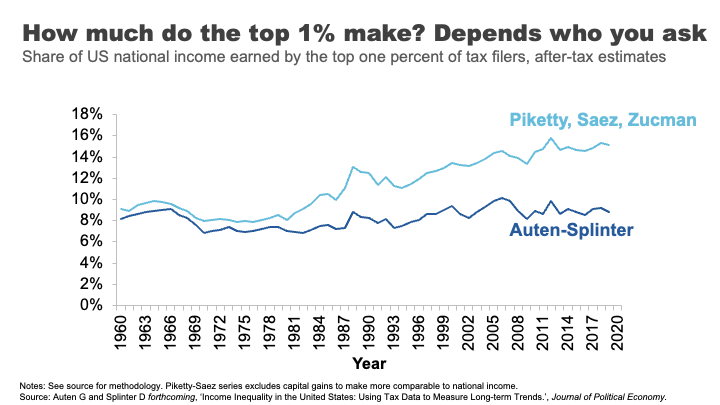
On one side of the war you have famous inequality researchers, Thomas Piketty and Emmanuel Saez.
They have spent the better part of two decades analysing inequality, including by using American tax data to document a significant and growing share of US incomes flowing to the top 1%.
It’s rare to get rock star economists, but these guys are it.
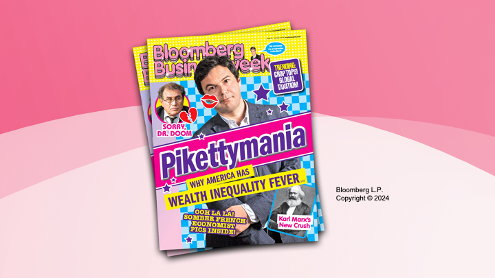
(As an aside if you purchased but did not finish Piketty’s hefty Capital in the 21st Century back at the height of Pikettymania in 2011 you are not alone, on some measures it is the second most unfinished book on Kindle, after Hilary Clinton’s autobiography...). 7
On the other side of the war sit Gerald Auten and David Splinter – their names might not ring any bells.
These two relatively unknown tax code nerds come from the US Treasury Department and Congress Joint Committee on Taxation.
Using the same tax data as Piketty and Saez, they come up with the opposite conclusion: after tax, the share of US income going to the 1 % has barely moved since the 1960s.
Cue much triumph from some commentators and members of the press.
But beyond the simplistic discussions of Piketty and Saez being proved ‘wrong’ was the more nuanced truth – both sets of researchers had made a series of judgments around issues like how to estimate ‘missing money’ not included in tax returns, and how to attribute spending on health, education or defence across the population.
The appropriateness of each of these judgements is now the subject of further debate, but what is clear is that what might seem like technical judgments can sometimes have a big effect on conclusions.
In all the analysis I present tonight we’ve tried to be as robust and open as we can about any judgments made. But I encourage you to keep your sceptics hat on.
3. There will be graphs
I’m an economist, there will be lot of graphs this evening. But I’ll do my best to ‘use my words’ and hopefully we can avoid data overload.
Income inequality in Australia
Ok, let’s start with talking about the broad distribution of income in Australia.
I know it’s not always au fait to talk about what you earn in public, so I’ll ask you to do this exercise in your heads. I want you to think about whether you consider yourself to be a low-income earner, a middle-income earner, or a high-income earner.
Let’s see how you went.
Here’s the distribution of Australian taxable income. That is, the income before tax but after you’ve made any allowable deductions.
If your taxable income is over about $51,000, you earn more than 50% of Australians who lodge a tax return. If you earn more than $95,000, that puts you in the top 20%. If you earn $336,000 or above – you are the 1%.
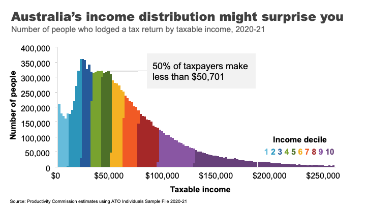
A surprising number of people get this wrong. In fact, the vast majority of us consider ourselves to be ‘middle income earners’. 8 This is probably because the people we tend to live near and associate with are more likely to be in a similar tax bracket to us.
This is presumably why every year or so high earners from the media and political class kick off passionate debates about whether $200,000 is really a high income 9 – while, I suspect, the 97 % of Australians earning less than that amount just roll their eyes.
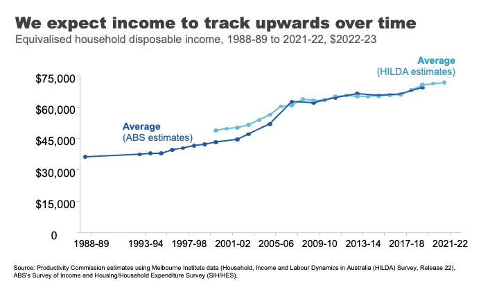
If we move to looking at using disposable income – that is income after tax and transfers – for an average Australian household, we can see that incomes have risen over time.
This is generally what we have come to expect, that outside of short dips during major economic shocks, income growth will continue its long march upwards over time.
And how has this growth been distributed?
The answer is relatively equally across the population in recent decades.
Indeed, in the 30 years between 1989 and 2019, income grew pretty consistently across the income distribution. Those in the top 10% experienced slightly higher growth than other groups, but nothing like the strong growth in income inequality seen in the US that dominates much of our inequality discourse.
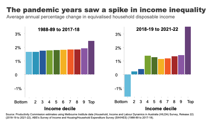
In contrast, the COVID period and its aftermath has seen greater dispersion with incomes at the top growing rapidly and those at the bottom going backwards.
The reasons are complicated, but reflect the roller coaster ride of lockdowns and recession, increases and withdrawals of government supports, and the healthy bounce back and high inflation that followed.
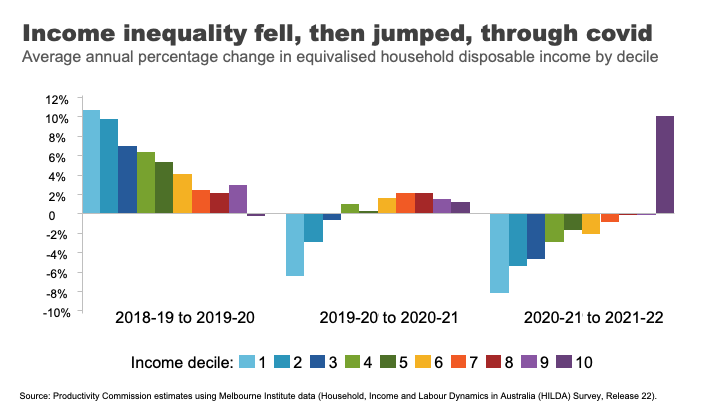
As you can see, the three years of the COVID period actually reflect three quite different inequality dynamics.
At the start of the COVID 19 pandemic, government-imposed lockdowns caused drastic declines in economic activity and widespread job losses. 10 In response, the Australian Government provided substantial support, which cushioned the economic harm across the community.
The effective doubling of the JobSeeker payment, and the flat $1500 per fortnight JobKeeper payment for workers in eligible businesses 11 produced high income growth for those at the bottom and middle of the income distribution.
As the economy re-opened, supports were withdrawn, those gains were reversed.
And despite the strong economy and labour market, high inflation meant real wages went backwards for most workers over the past two years.
In contrast, high income households benefited from rip-roaring growth in business income as well as decent investment income, as the economy recovered.
Overall, and barring any further major shocks, we can probably expect the next few years will bring a return to a more ‘normal’ income growth and certainly to the more consistent patterns seen across the distribution observed in the pre-COVID era.
It is also interesting to reflect on how we compare to other nations.
Egalitarianism is tied up with Australian identity. We are the land of the ‘fair go’, a place where your taxi driver, your boss, and even the Prime Minister can all be safely referred to as your ‘mate’.
But does the reality match the mythology?
Not entirely.
Australia’s income inequality is ‘middle of the pack’ by rich-country standards. Comparing based on the Gini coefficient – a measure of overall inequality – Australia is close the OECD average.
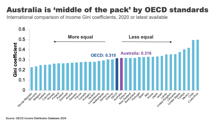
Overall, we not as unequal as our friends in the US and the UK, but nor are we as egalitarian as the Nordic countries.
One important reason for these large cross-country differences is differences in tax and transfer policies.
For example, the US starts relatively unequal, but by no means the most. But because they redistribute income less, they end up the most unequal of Western nations. 12 In contrast, Finland has close to US-levels of inequality before taxes and transfers. After, it is one of the most equal nations in the OECD. 13
These are important differences that highlight a point I want to come back to: policy choices matter to inequality.
But now we have a snapshot of how Australians across the distribution have fared over time and relative to elsewhere, I want to turn to another important part of the inequality story: outcomes and opportunities for the most disadvantaged.
Poverty in a rich country
It’s almost 40 years since Bob Hawke declared that no child would live in poverty by 1990. 14
But, according to ACOSS, one in eight people lived below the poverty line in 2019-20, including one in six children. 15
This measure of poverty looks at relative income poverty – it’s set at 50 % of the typical Australian household disposable income, less housing costs.
Some argue it is better to look at absolute measures (for example, the amount of money required to be sure a household can achieve a basic standard of living) or indicators of material deprivation.
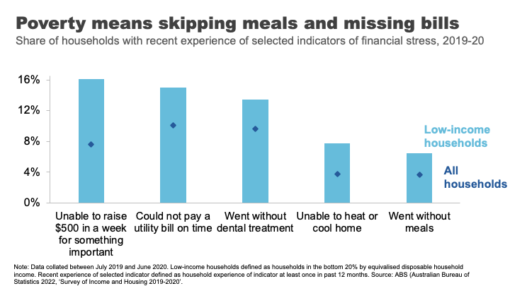
For example, amongst low-income households in 2019-20, 16% were unable to raise $500 for something important, 8% were unable to heat their homes, and 7% went without meals. 16
And it’s that sense of precariousness that pushes the impacts of poverty from the material to the mental. And those impacts can have a long tail.
As journalist Rick Morton writes about his own childhood growing up in a poor household: 17
I saw Mum’s daily, sometimes hourly, battles to stay solvent. I saw how hard she worked and what it did to her body and her mind. The stress of even thinking of it now is difficult to explain. It is built not only into my own mind but also in my flesh. The things I will do to avoid the feeling today. The things I try to do for Mum to make it so she never has to feel it again.
The biggest risk factors for poverty are: being on JobSeeker or Parenting Payment. 18
Policy and poverty remain inextricably linked.
Wealth inequality in Australia
Of course economic differences are not just found in incomes. Wealth or how much money you have ‘behind you’ is an important determinant of outcomes too. Wealth is a buffer – it can be converted into future consumption opportunities and provides a sense of financial security.
That is why we understand the pensioner who owns their home and has $250,000 in the bank is in a materially different economic position to the single part-time worker who records a similar $30,000 income but has few assets.
Wealth has grown significantly in Australia in recent decades.
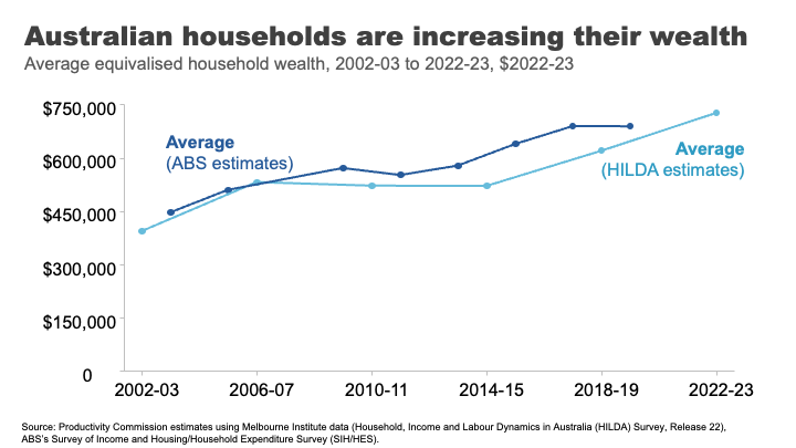
I remember in primary school the shorthand for someone really, really, rich was a ‘millionaire.’ The average Australian household is now more than halfway to that benchmark. Indeed, a person that owns a typical house outright in Clarence Gardens is a ‘millionaire’. 19
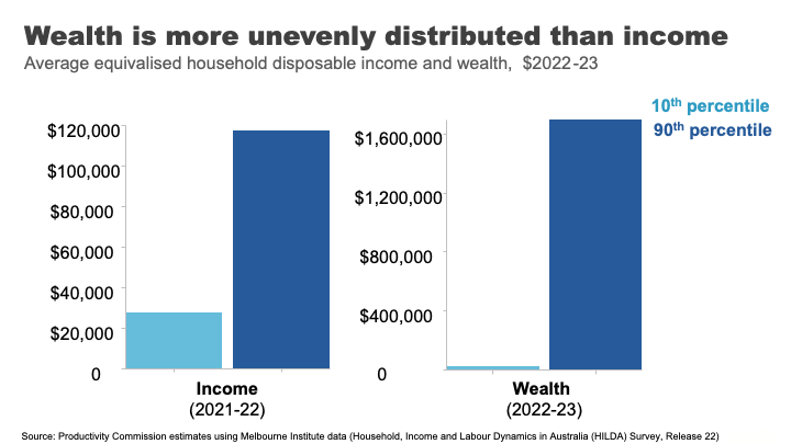
Wealth overall is much less evenly distributed than income.
If we take a household at the 90th %ile for wealth, they have almost 70 times as much wealth as the Australians at the 10th %ile. For income the figure is only four times as much.
Wealth also has much greater extremes.
In his 2013 book on inequality, Battlers and Billionaires, Parliamentarian and economist Andrew Leigh provided a memorable analogy, which I have updated today:
Imagine a ladder on which each rung represents a million dollars of wealth. If we were to put all Australian households on this ladder 50% of us are about halfway to the first rung, the top 10 % are about 1.5 rungs up, the top 1% are reaching for the fifth rung – just high enough to clean the gutters. 20 Gina Rinehart is more than 11kms off the ground. 21
But even with this very long ladder, Australia’s wealth inequality is lower than many other OECD countries. 22
But an important question is how has the distribution changed in recent decades?
The answer is: it’s complicated.
Pre-pandemic, wealth grew faster for the top half of the distribution.
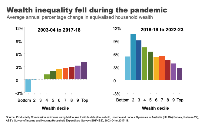
But the pandemic once again, produced some surprising results.
This pattern flipped and wealth grew more quickly overall and significantly faster for lower and lower middle wealth groups during the COVID period.
The two main reasons for this are:
- The strong growth in housing prices, particularly in the regions and the smaller capital cities. This had the biggest impact for homeowners in the lower middle and middle parts of the wealth distribution.
- Higher income from increased government support during the pandemic and fewer opportunities to spend, helped boost bank balances and debt repayment among low-wealth households. 23
And while this is good news for many households at least in the short-term, the longer-term run-up house prices has produced a different set of inequality concerns.
A decaying dream? House prices and inequality across generations
Here I want to stop and reflect on the different ways in which the very strong growth in house prices has impacted economic outcomes for different groups in Australia.
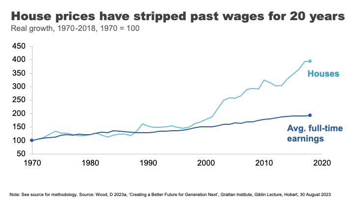
Until the 1990s, house prices broadly tracked growth in incomes. But between 1992 and 2018 they grew at almost three times the pace on average. 24
The effect has been an increase in the upfront barrier to home ownership and increasingly also the ongoing costs for those that are able to clear that hurdle.
The result, unsurprisingly, has been falling home ownership.
In the early 1980s, when my parents were buying their first home, around 70% of those in their early 30s owned a home. Today that figure is just 50%. And the drops have been particularly acute amongst low-income young people. 25
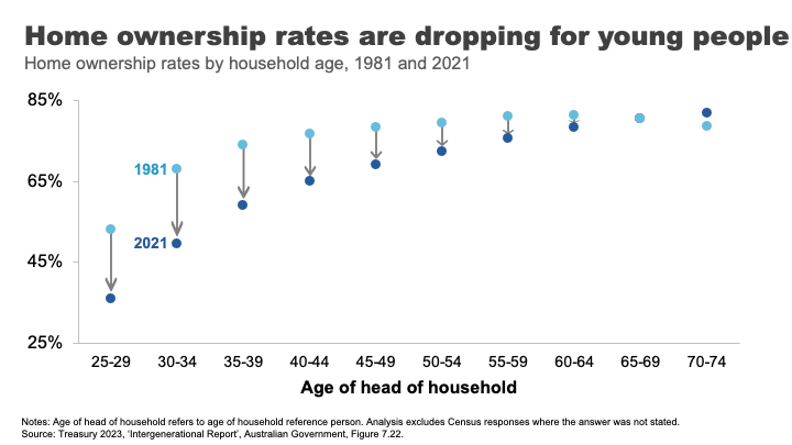
The declining opportunities for homeownership are a particular source of dissatisfaction and unrest amongst many non-homeowning younger Australians. Amongst the so-called Generation Z non-homeowners, 93% want to own their own home. But only 63% think it is likely that they ever will. 26
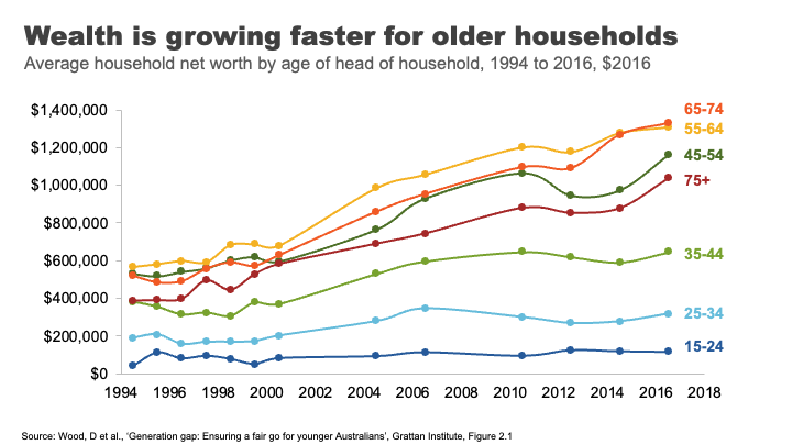
The rise in house prices has also contributed to rising generational disparities in wealth accumulation.
Older households have always had more assets on average than younger ones. But the run up in house prices has created windfall gains for existing homeowners. This has been a major contributor to the rapid growth in wealth among older households.
A household headed by someone aged 65-74 had on average $1.3 million in assets in 2016, up from $900,000 for the same age group in 2004. Rising asset prices over the past seven years mean this figure is almost certainly substantially higher now.
In contrast, the wealth of households under 35 has barely moved in 15 years. And poorer young Australians have less today than poorer young Australians did 15 years ago. 27
Overall the developments in the housing market over recent decades have left many, particularly many older Australians, very well off. But the cost has been considerable housing stress amongst the vulnerable, and a generation of younger Australians who will reach middle age with substantially lower rates of home ownership than their parents.
Land of the fair go? Social mobility in Australia
Now I want to move from the photo to the movie: from talking about disparity in economic outcomes at a point in time to talking about how these outcomes can evolve over someone’s life.
A question that has rightly been of interest to those concerned about inequality, is how does inequality in outcomes influence equality of opportunity. ;Or to be more specific – how much are economic opportunities determined by who are our parents are?
Generational mobility has historically been a hard thing to study. To understand its dynamics we need linked data on parental economic outcomes and those of their children over a long duration.
In the absence of this type of data, at least until recently, people got creative.
In one of my favourite studies, Parliamentarian Andrew Leigh alongside co-authors Gregory Clark and Mike Pottenger, identified rare surnames in the 2014 electoral roll among doctors and university graduates from 1870. They found, nearly 150 years later, that people with those rare surnames are more likely to be in the so called ‘elite’ professions than people with surnames such as Smith.28
Indeed, they found that so called ‘status persistence’ for surnames was as high in Australia as for England or the United States. 29
In somewhat brighter news, more recent studies using linked administrative data point to a more optimistic picture on social mobility in Australia.
Looking at economic outcomes for a million individuals born between 1978 and 1982 Economists Nathan Deutscher and Bhashkar Mazumder find that Australia is one of the more economically mobile advanced economies. 30>
Indeed, they find Australia’s ‘intergenerational elasticity of income’ (a measure of how much your family’s income affects your own) is similar to Canada and close to those of the Nordic countries, and considerably more mobile than places like the United States. 31
In forthcoming work the Productivity Commission uses family-linked tax data that confirms that estimates of intergenerational mobility remain comparatively high.
But in contrast, things may be stickier for those doing it toughest.
In a 2017 study, Professor Deborah Cobb-Clarke and her co-authors showed that young people are 1.8 times more likely to need social assistance if their parents have a history of receiving social assistance themselves. 32
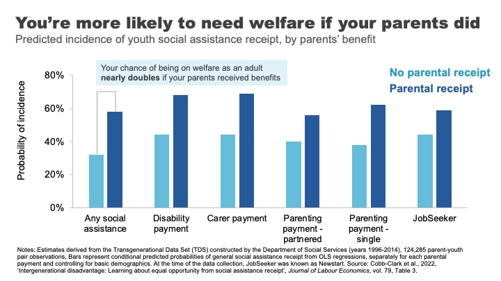
Consistent with this, the Productivity Commission’s forthcoming work shows that people in their late 20s whose parents received social transfer payments were about one and a half times more likely to receive social transfer payments themselves.
The Cobb-Clarke work showed that these transmission effects were particularly pronounced for disability payments, payments for those with caring responsibilities, and parenting payments for single parents. Interestingly, disadvantage stemming from parents’ poor labour market outcomes was much less persistent. 33
Cobb-Clarke and her co-authors posit that parental disadvantage may be more harmful to children’s later life outcomes if it is more strongly driven by circumstances rather than personal choice.
This aligns with the growing appreciation by economists of the impact of lack of hope or despair in shaping life choices and outcomes. 34
This was the sentiment expressed by a Tasmanian woman on welfare supports: 35
It’s not so much what we are missing out on, it’s the next generation and it is a hard cycle to break because they look at it and think, well, what’s the point? We’re always going to be poor, things are hard, nothing’s going to get better. Why should we bother?
Schools under stress: a red flag for future mobility?
One of the foundational supports for economic mobility is a strong education system.
Indeed, educational attainment has been estimated to explain up to 30 % of the transmission of economic advantage between parents and children. 36
Australia has historically had a strong system of school education that has supported opportunities across the population.
But there are some red flags for future prosperity and mobility that we should heed.
Indeed, despite growing funding in recent years, Australia’s school system has not been delivering the results we want for our young people.
Data from the OECD suggest that the performance of Australian school students in Reading and Maths is going backwards, with significant falls in our levels of achievement since 2000.
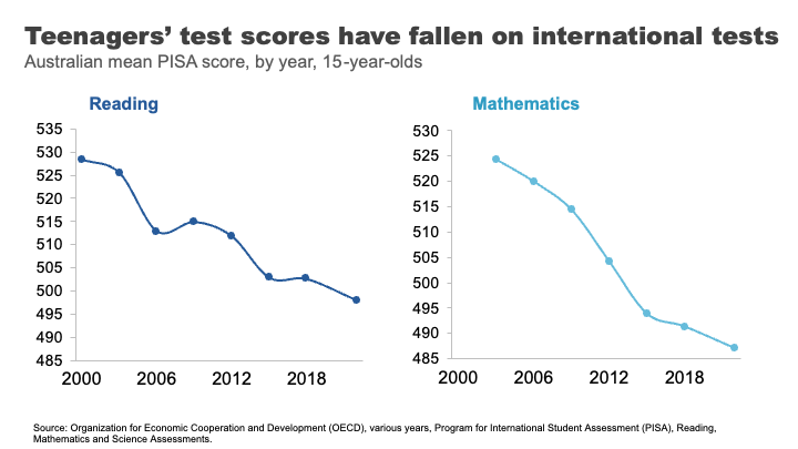
Estimates based on this data suggest the average Australian Year 10 student in 2018 was eight months behind in reading compared to where Year 10 students were at the turn of the century, and results have largely flatlined since. 37 We’ve seen even sharper declines in mathematics scores, where the decline for Year 10 students by 2018 was almost a year of learning.
But how much does parental background make a difference to how students fare?
The answer is a lot. More than half of the most economically disadvantaged 15-year-old students in Australia are not proficient readers.
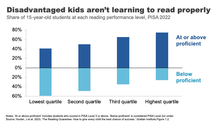
Analysis from the Grattan Institute shows that the disparity in outcomes was worse in Australia than in Canda or the UK and on par with the US. 38
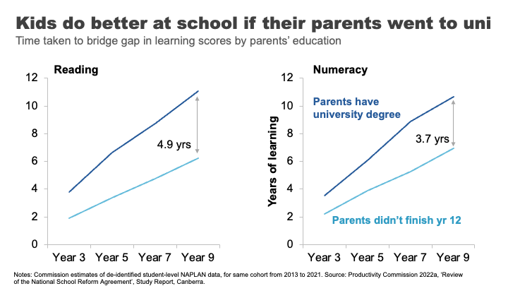
These gaps in performance widen through the schooling process.
The Productivity Commission looked at this using NAPLAN data. 39 We compared the average reading outcomes of students whose parents did not finish high school to those whose parents have a bachelor’s degree or higher. We found the learning gap – equivalent to almost two years of reading achievement in Year 3, progressively widens to an almost 5-year learning gap by the time students reach Year 9.
For mathematics, the gap widens from 1.3 to almost 4 years.
If we take education as an indicator of both a country’s future economic prosperity and its social mobility – this data must concern us.
It has been pleasing to see senior leaders, including here in South Australia, engage with this issue and its implications. But turning the ship around will require significant shifts in the way we deliver education in Australia.
A nation divided: why mixing matters for mobility
Another less obvious mobility-enhancer is where we grow up, and more specifically, who we grow up with.
US economist Raj Chetty and co-authors made a splash in 2014, when their study using administrative records on the incomes of more than 40 million children and their parents found very large variations in social mobility across the US. For example, they estimated a child from the poorest 20% of families had nearly a 3 times better chance of making it into the top 20% of income earners as an adult if they lived in Silicon Valley rather than Charlotte North Carolina. 40
In a later paper, Chetty and another co-author reinforced the importance of these neighbourhood effects by studying outcomes for families who moved to different parts of the Unites States.
They found that outcomes for children whose families move to a better neighbourhood improve the more time they spend there.
Indeed, every additional year in a ‘good neighbourhood’ sees that child’s outcomes converge closer to the average for that neighbourhood by about 4 %.41
And if you are thinking that this type of locational lottery could only exist in a place as unequal as the United States – think again.
Economist Nathan Deutscher has replicated this work for Australia. 42
And while the dipartites between regions are less pronounced here, we see the same convergence in outcomes, the longer a child is exposed to a ‘good neighbourhood’.
Deutscher finds that place matters most during the teenage years and suggests it might be ‘peer effects’ that explain locational differences in outcomes.
In other words, who you hang around with in those formative years makes a difference. Which may well be a validating result for any parent that has ever uttered the immortal phrase: “If Tanya jumped off a cliff, would you do it too?”.
This is consistent with more recent work that suggests it is economic connectedness – the capacity of low socioeconomic people to make friends with those from higher socioeconomic groups – that is the principal driver of social mobility. 43
And this is the very thing that gets lost as neighbourhoods and schools become more stratified and we participate less in social mixing opportunities. This means that observed declines in the types of activities that help build the social glue – from volunteering, to local sport, to attending church – over time might further erode social mobility.
What’s a policy maker to do?
Where does all this leave policy makers?
How much policy makers should seek to address inequality is not a straightforward question. It has been dissected by philosophers since Plato. And economists have been at intellectual fisticuffs over it for much of the past century.
Today, even the strongest advocates for greater equality will acknowledge that some inequality is inevitable and that it is important to maintain incentives for innovation and effort.
Many of the richest people in the world – Gates, Dyson, Musk – are innovators whose work has reshaped our lives. It is at least partly the ‘size of the prize’ available to successful innovation that drives the efforts and risks of would-be innovators and entrepreneurs.44
On a more relatable level, let’s think of the University we are at tonight. Would we expect students to flow through these gates to spend years of their lives learning about engineering or medicine or economics, and to work long hours while establishing themselves in their career, without some return for these efforts? In other words, incentives are important for growing the pie, even if they result in a somewhat unequal distribution of it.
On the other hand, even many of capitalism’s biggest cheerleaders raise concerns about the social and economic implications of stark economic dispersion.
Recently the IMF has warned that high inequality and especially poor social mobility can impact on long-term economic growth. 45 Others have shown that physical and mental health problems are worse in more unequal societies, predominantly due to the physiological stress of operating within a steep economic hierarchy. 46 And still others have linked rising inequality, or declining social mobility, 47 with the rise of populism as the ‘left behind’ lodge their protests vote against the so called elite.
All of this is to say that targeting inequality is complex. And while the ‘line’ across which inequality flips to doing more harm than good is far from clear, what is clear is that policy makers have a broad set of tools that can help push in their desired direction.
A policy makers’ toolbox
A few years ago, a group of high-profile economists organised an international conference on combatting inequality with a mission of engaging with the full suite of policy responses. 48
Their conclusion, although not revolutionary, provides helpful clarity: that the right policy response depends on why you care about inequality.
In particular, they draw a distinction between policies concerned with:
- outcomes for most disadvantaged – particularly for addressing entrenched poverty
- boosting opportunities for a ‘hollowed out’ middle class – a much greater concern in the United States than here, where, as we have seen, income growth has been broader based
- opportunity hoarding – or the way wealthy people might leverage their economic and political power to entrench their position.
The right policy tool will also depend crucially on whether policy makers are more concerned with equality of opportunity or outcomes.
Below is an adapted version of the taxonomy they created. It shows the breadth – and importantly the targeting of different levers that a would-be inequality buster might pull.
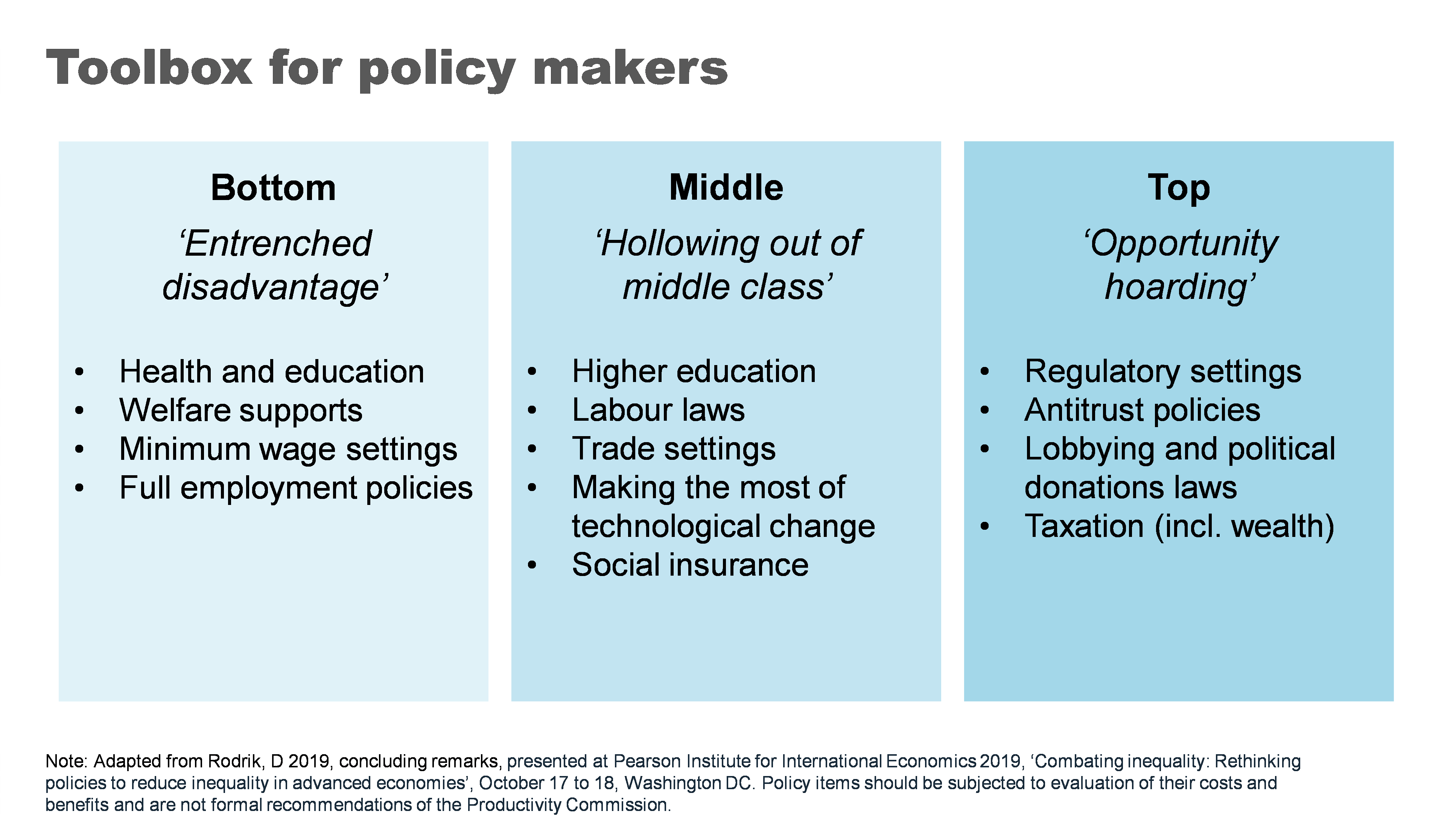
Now I do not advocate for all of the policies proposed. Indeed, whether any of these policies would be a good idea would require careful analysis of the costs and benefits in the particular context you might use them. There are probably good ideas that have been left out too.
But I did want to talk very briefly about four of the ‘biggies’ that I think really matter in an Australian context.
Growing the pie can mean bigger slices for all
Now in a presentation largely focused on distribution of the pie, I want make the case for making the pie bigger.
A cross-country and cross time evaluation suggests that growth is effective in reducing poverty. 49 Indeed, incomes for the bottom 10% are highly correlated with overall economic growth – a rising tide lifts some very important boats. We could put this beyond doubt for Australia by addressing some of the weaknesses in the current social safety net - a point I’ll return to.
The impact of higher economic growth on overall inequality is less clear. 50 But what is clear is that faster economic growth gives governments more room to support more generous welfare policies as well as other social spending on areas like education and health that particularly benefit those at the bottom and middle of the income distribution.
More generally healthy income growth can also support the political ‘buy in’ for these types of policies. 51
As for what governments can do to grow the pie – that would be a whole other lecture. But if the pie is of interest: ‘here’s one I prepared earlier’. My colleagues have published a comprehensive 1000-page guide for governments looking for ways to boost productivity and growth. 52
Fixing the housing mess
A functioning housing system is critical for improving our social and economic outcomes. Building more houses closer to jobs and amenities is needed to help younger and poorer Australians access the same opportunities as previous generations.
Australia’s population has grown strongly over the past two decades and will likely continue to do so. We can choose to push people out to the ever-expanding fringes of our cities or accommodate them through boosting supply in the inner and middle ring suburbs where most would prefer to live.
Allowing greater density in these areas not only expands supply but also boosts variety in housing choices, supporting more of the cross-socio economic mixing critical to social mobility.
After at least two decades of letting the ‘housing market frog’ slowly boil, there have been some positive steps from both Commonwealth and State governments to support the planning changes needed to boost supply. In particular, the Commonwealth government has offered incentives for states to target the construction of 1.2 million new homes over the next five years. 53
Similarly, moves to boost social housing are also a positive step, particularly where they’re targeted to those with the highest need.
Unfortunately, this new-found policy energy has come at the same time as the building industry faces challenges in ramping up.
But over time, if ambitious growth targets can be met, this could be a powerful shift in reducing inequality both within and between generations.
An education revolution?
School education is fundamental to supercharging opportunities for the next generation.
And while some of the problems our system faces are thorny, some of the solutions are surprisingly straightforward.
Our focus should start with getting the basics right – our schools should be supported and held accountable for delivering basic levels of literacy and numeracy. 54 My former colleagues at Grattan have called for a ‘Reading Guarantee’ – whereby governments would commit to ensuring at least 90 % of Australian students learn to read proficiently at school. 55
Supporting schools and teachers to deliver on these basics would require:
- making sure all teachers adopt evidence-based teaching practices such as phonics decoding for reading 56
- providing all schools and teachers access to a bank of well-sequenced high-quality curriculum materials 57
- reducing low value tasks for teachers to free them up to spend time on what really matters, 58 and
- providing better career paths to help schools attract and retain top teachers, and allowing top teachers to support and develop others in the profession. 59
Boosting social safety net
The Federal Government’s Economic Inclusion Committee just released its second report designed to inform the budget process.
Its lead recommendation remained unchanged from last year: to increase the rate of the JobSeeker and related income support payments.
The Committee finds that Australia’s unemployment benefits have been slipping further and further behind community living standards for two decades. 60
And while the recent 10% increase to Commonwealth Rent Assistance will provide much needed relief – as did the extra 15% in the last Budget – the Committee’s report demonstrates that the value of the payments has fallen significantly relative to average rents for the past 25 years. 61
Today, Australia’s payments to the short-term unemployed, including housing benefits, are the least generous in the OECD. 62
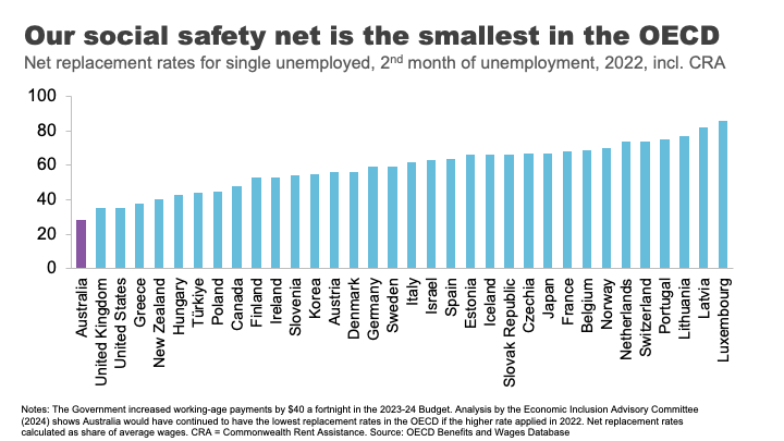
No single measure would do more to alleviate poverty than a material change in these payments.
What’s stopping us?
Partly it’s likely to be well-meaning concerns about the impact on incentives to work.
But consistent with previous work, the Economic Inclusion Advisory Committee finds that the negative effect on incentives is likely to be small, because current levels of the payment are so far below incomes from working. 63
Indeed, for those facing economic exclusion, higher income support payments may improve the capacity to search for and accept employment. 64
Second, is the cost. Moving as far as the Economic Inclusion Advisory Committee recommends on JobSeeker and related payments could cost up to $4.6 billion per year, 65 which is not straightforward for governments balancing a range of competing priorities. But as targeted interventions to address poverty go, there is very little waste.
Finally, there is the question of community support. Boosting Jobseeker payments rarely garners majority support across the population. 66 As I have previously argued, this is less a case of Australians being mean spirited and more about the grip of some persistent and unhelpful myths about welfare recipients. Your regular community service reminder tonight: the median Jobseeker recipient is a 45-year-old woman. 67
Finding our inner Stretton
And with that I want to wrap up where I began, with Stretton’s legacy.
Inequality is one of those topics where it is easy to simply revert to tired tropes, particularly off shelf ones from elsewhere.
Stretton encouraged us to look with curiosity and rigour, but also with an open heart. In doing so, everyone may take away something different from the numbers and analysis I have shared tonight.
To me, there are bright spots in the story. Australia has grown its income and wealth over several decades, and it has shared those gains broadly. Social mobility is relatively high.
On the other hand, many relying on payments are in poverty and the long shadow of that experience can be hard for children to escape. Our schools and suburbs are becoming less of a springboard for mobility. And we have made the Australian dream out of reach for a generation of young people.
Policy matters – there are many levers that governments can pull to make a difference to these outcomes. But it is up to Australians to decide which ones we want them to use.
Footnotes
- Munro, D 2016, ‘The House that Hugh Built, the Adelaide history department during the Stretton era, 1954-1996’, History of Education vol. 46, no. 5, p.634.. Return to text
- Ibid, p.631. Return to text
- Spoehr, J 2015, ‘Hugh Stretton: a great Australian public intellectual’, The Adelaide Review, 7 September. Return to text
- Davison, G 2018, ‘Watching a brilliant thinker stretching his mind’, Inside Story, 11 October. Return to text
- Spoehr, J 2015. Return to text
- Gibilisco, P and Stretton, H 2003, ‘A pragmatic social democrat: an interview with Hugh Stretton’, The Journal of Australian Political Economy, vol. 51, pp. 13. Return to text
- The Guardian 2014, ‘Can the Hawking Index tell us when people give up on books?’, 8 July.Return to text
- Hoy, C, and Mager, F 2021 ‘Why are relatively poor people not more supportive of redistribution? Evidence from a randomized survey experiment across ten countries.’ American Economic Journal: Economic Policy, vol. 13, no. 4, pp. 299–328.Return to text
- Hobman, J 2022, ‘EXCLUSIVE: 'It barely cuts it': Aussie finance guru exposes why $200,000 a year is NOT a big salary anymore - despite most of the country earning MUCH less - but not everyone agrees’, The Daily Mail, 14 July; Martin, P 2021, ‘Other Australians don’t earn what you think. $59,538, is typical.’ The Conversation, 8 June. Return to text
- Coates, B and Ballantyne, A 2020, ‘No one left behind: Why Australia should lock in full employment’, Grattan Institute. The unemployment rate surged from 5.2% in March 2020 to a peak of 7.5% in July 2020. ABS (Australian Bureau of Statistics) 2024, ‘Labour Force, Australia, Detailed, February 2024’. Return to text
- The Australian Government provided JobKeeper payments of $1,500 per fortnight to eligible businesses, which had to be paid to their employees, to minimise job losses and maintain employment and job attachment. AIHW (Australian Institute of Health and Welfare) 2021, ‘Australia’s welfare 2021: data insights’, pp. 84–86. The flat payment of $1,500 per fortnight meant some people – particularly part time workers – received more than their salary, while for others it led to a reduction in their salary. Treasury 2023, ‘The Australian Government Independent Evaluation of the JobKeeper Payment Final Report’, 28 September. Return to text
- Hasell, J 2023, ‘Income inequality before and after taxes: How much do countries redistribute income?’, Our World in Data Return to text.
- Ibid. Return to text
- As Prime Minister, Bob Hawke made the declaration in 1987, with the intention to reach the goal by 1990. Hawke, B 1987, speech delivered at Sydney, NSW, June 23rd, Museum of Modern Democracy: Election Speeches. Return to text
- Davidson, P, Bradbury, B and Wong, M 2023, ‘Poverty in Australia 2023: Who is affected’, Poverty and Inequality Partnership Report no. 20, Australian Council of Social Service and UNSW Sydney. Return to text
- ABS (Australian Bureau of Statistics) 2022, ‘Survey of Income and Housing 2019-20’, Australian Government. Return to text
- Morton, R 2020, On Money, Hachette Australia, p.18. Return to text
- Davidson, P, Bradbury, B and Wong, M 2023. Return to text
- ‘Clarence Gardens Adelaide - Greater Region, SA 5039’, https://www.realestate.com.au/sa/clarence-gardens-5039/, accessed 12 May 2024. Return to text
- Leigh, A 2013, Battlers and Billionaires: The Story of Inequality in Australia, Schwartz Publishing, Melbourne, updated according to Productivity Commission estimates using Melbourne Institute data (Household, Income and Labour Dynamics in Australia (HILDA) Survey, Release 22). Return to text
- Estimate based on data from AFR (Australian Financial Review), ‘Rich List 2023’, https://www.afr.com/rich-list, accessed 12 May 2024. Return to text
- Shorrocks, Lluberas, Davies and Waldenström 2023, ‘Global Wealth Report 2023’, Credit Suisse and UBS Global Wealth Databook. Return to text
- See Productivity Commission 2024, ‘A snapshot of inequality in Australia’, Research paper, Canberra, pp. 25-30 for a discussion. Return to text
- Wood, D 2023a, ‘Creating a Better Future for Generation Next’, Grattan Institute, Giblin Lecture, Hobart, 30 August 2023. Return to text
- Coates, B 2022, ‘Levelling the playing field: it’s time for a national shared equity scheme’, Grattan Institute. Return to text
- Susan McKinnon Foundation 2023, ‘McKinnon Poll: Understanding attitudes towards housing in Australia’, September, p.90. Return to text
- Wood, D 2023a. Return to text
- The authors define a set of elite ‘rare’ surnames in 1900 as those surnames where 29 or fewer people held the name in Australia in 2014 in the voting roll, and where someone holding that name graduated from Melbourne or Sydney universities 1870-1899. Clark, G, Leigh, A, and Pottenger, M 2020, ‘Frontiers of mobility: Was Australia 1870–2017 a more socially mobile society than England?’, Explorations in Economic History, vol. 76. Return to text
- Ibid. Return to text
- Deutscher, N and Mazumder, B 2020, ‘Intergenerational mobility across Australia and the stability of regional estimates’, Labour Economics, vol. 66. Return to text
- Ibid. Return to text
- Cobb-Clark et al., 2022, ‘Intergenerational disadvantage: Learning about equal opportunity from social assistance receipt’, Journal of Labour Economics, vol. 79. Return to text
- Ibid, pp.16-17. Return to text
- Case, A and Deaton, A 2020, Deaths of despair and the future of capitalism, Princeton University Press, Princeton. Return to text
- TASCOSS 2022, ‘Wellbeing First: A budget proposal to ease the cost of living and invest in the long-term wellbeing of Tasmanians’, 2023-24 TASCOSS Budget Priorities Statement, p.12. Return to text
- Breunig, R and Taylor, M 2023, ‘Success in life is tied to parental education. That’s why we need to track intergenerational school performance’, The Conversation, 14 February. Return to text
- Hunter, J et al. 2023, ‘The Reading Guarantee: How to give every child the best chance of success.’ Grattan Institute. Return to text
- Ibid, p.10. Return to text
- Productivity Commission 2022a, ‘Review of the National School Reform Agreement’, Study Report, Canberra. Return to text
- The authors found a child whose family is amongst the 20% most disadvantaged has a probability of ending up in the top 20% of income earners of just 4.4% if they live in Charlotte North Carolina, but 12.9% if they live in San Jose, in the heart of Silicon Valley. Chetty, R et al. 2014, ‘Where is the land of opportunity? The geography of intergenerational mobility in the United States’, The Quarterly Journal of Economics, vol. 129, no. 4, November, pp. 1553-1623. Return to text
- Chetty, R and Hendren, N 2018, ‘The impacts of neighborhoods on intergenerational mobility I: Childhood exposure effects’, The Quarterly Journal of Economics, vol. 133, no. 3, August, pp. 1107-1162https://academic.oup.com/qje/article/133/3/1107/4850660?login=false Return to text
- Deutscher, N 2020, ‘Place, peers, and the teenage years: Long-run neighborhood effects in Australia’, American Economic Journal: Applied Economics, vol. 12, no. 2, pp. 220-49. Return to text
- Chetty, R et al. 2022, ‘Social capital I: Measurement and associations with economic mobility’, Nature vol. 608, pp. 108-121. Return to text
- Deaton, A, ‘What’s wrong with inequality?’, The IFS Deaton Review, panellist introduction, https://ifs.org.uk/inequality/themes/whats-wrong-with-inequality/, accessed 19 May 2024. Return to text
- Cerra et al. 2021, ‘Links between growth, inequality, and poverty: A survey’, IMF Working Papers, Working Paper No. 2021/068. Return to text
- Wilkinson, RG and Pickett, KE 2009, ‘Income inequality and social dysfunction’, Annual Review of Sociology, vol. 35, pp. 493–511. Return to text
- Protzer, ESM 2019, ‘Social Mobility Explains Populism, Not Inequality or Culture’, Center for International Development at Harvard University, Working Papers, no.118. Return to text
- Pearson Institute for International Economics 2019, ‘Combating inequality: Rethinking policies to reduce inequality in advanced economies’, conference papers, October 17 to 18, Washington DC. Return to text
- Cerra et al. 2021. Return to text
- Ibid. Return to text
- Weisstanner, D 2023, ‘Stagnating incomes and preferences for redistribution: The role of absolute and relative experiences’, European Journal of Political Research, vol. 62, pp. 551-570. Return to text
- Productivity Commission 2023, ‘5-year Productivity Inquiry: Advancing prosperity’, vol. 1, Inquiry Report no. 100, Canberra. Return to text
- Productivity Commission 2022a, ‘Review of the National School Reform Agreement’, Study Report, Canberra. Return to text
- Hunter, J et al. 2023, ‘The Reading Guarantee: How to give every child the best chance of success’, Grattan Institute. Return to text
- Ibid. Return to text
- Hunter, J et al. 2022, ‘Ending the lesson lottery: How to improve curriculum planning in schools’, Grattan Institute. Return to text
- Productivity Commission 2022a. Return to text
- Goss, P and Sonnemann, J 2020, ‘Top teachers: Sharing expertise to improve teaching’, Grattan Institute; Gonski, D et al. 2011, ‘Review of funding for schooling: Final report’, Australian Government Department of Education, Employment and Workplace Relations. Return to text
- EIAC (Economic Inclusion Advisory Committee) 2024, ‘2024 Report to Government’, Australian Government Department of Social Services. Return to text
- EIAC 2024, p.62. See also Productivity Commission 2022b, ‘In need of repair: The National Housing and Homelessness Agreement’, Study Report, Canberra. Return to text
- EIAC 2024, p.54. Return to text
- EIAC 2024, pp.49-55. Return to text
- Ibid, p.55. Return to text
- EIAC, p.47. Return to text
- Wood, D 2023b, ‘The three myths that keep Australians in poverty’, The Sydney Morning Herald, 25 April. Return to text
- Ibid. Return to text
Acknowledgment
I would like to thank Productivity Commission staff especially Carmela Chivers, Sara Collard and the inequality team for their assistance with this speech. The speech draws heavily on their most recent work: A snapshot of inequality in Australia. All good ideas and analysis theirs – all mistakes my own.